Step 1: Understand
It starts with the problem, not the solution. Context, people, goals and priorities come into focus before any form is chosen.
What comes out: a clear direction to start from.
Naki — Independent creative studio
And, yes, the code too.
At Naki, design, strategy and development work together to shape websites, identities and digital experiences.
Why Naki?
For years, whoever designed a website and whoever built it were two different people.
And in the handoff, something always got lost along the way.
Naki was born to close that gap.
Here, things are designed knowing how they'll be built, and built respecting how they were designed. And when something more is needed, the right people step in.
What happens here
Four areas that often end up in the same project. Sometimes you only need one. Sometimes they all come together.
Websites and interfaces built around the people who'll use them, not around templates. It starts with structure, moves through wireframes and prototypes, and ends with a visual system that has to be clear before it's beautiful.
Pretty ≠ usable. You want both.
From layout to browser. What gets designed becomes real exactly as it was intended: responsive, fast, accessible websites that are easy to manage. Custom front-end when it's needed; WordPress, WooCommerce or Shopify when they're the right fit.
Yes, it actually works.
A logo is just the beginning. Identity is built as a system: typography, color, imagery and rules that make a brand recognizable wherever it shows up.
More than a logo. Obviously.
From screen to paper, without switching languages every time. Social, campaigns, editorial and communication materials designed to keep a brand consistent even when the format changes.
Same brand. Different places.
Selected work
Websites, identities and e-commerce that came through Naki. Open a project to see what needed solving and how it took shape.
 Coming soon
 Coming soon
 Coming soon
More projects are on their way.
Start yoursA small manifesto
functional, clear, easy to use, recognizable, accessible, fast, consistent, simple to manage.
How things get done
No complicated processes just to look important. Work starts from what's actually needed, then finds the right way to get there.
It starts with the problem, not the solution. Context, people, goals and priorities come into focus before any form is chosen.
What comes out: a clear direction to start from.
Structure, wireframes, identity or interface: the project starts to take shape. Every choice has a reason, and it can be explained.
What comes out: something to see, discuss and put to the test.
What was designed becomes real. Code, components, applications or materials: no unnecessary handoffs, and no shortcuts that change the project halfway.
What comes out: work that holds up outside the design file.
Testing, fixing, sorting out whatever still doesn't add up. Responsive layouts, details, content, exports or launch: this is where the project stops looking finished and actually is.
What comes out: a project ready to use, and you know how to run it.
Behind Naki
The human behind Naki.
I'm a designer and developer, and Naki is where I bring together the things I love doing: designing, building and giving ideas a visual direction.
I follow every project closely, from start to finish. And when a project needs extra skills, I work with studios and agencies I trust.
You don’t need to have it all figured out. An idea, even a slightly messy one, is enough to start. The rest can take shape from there.
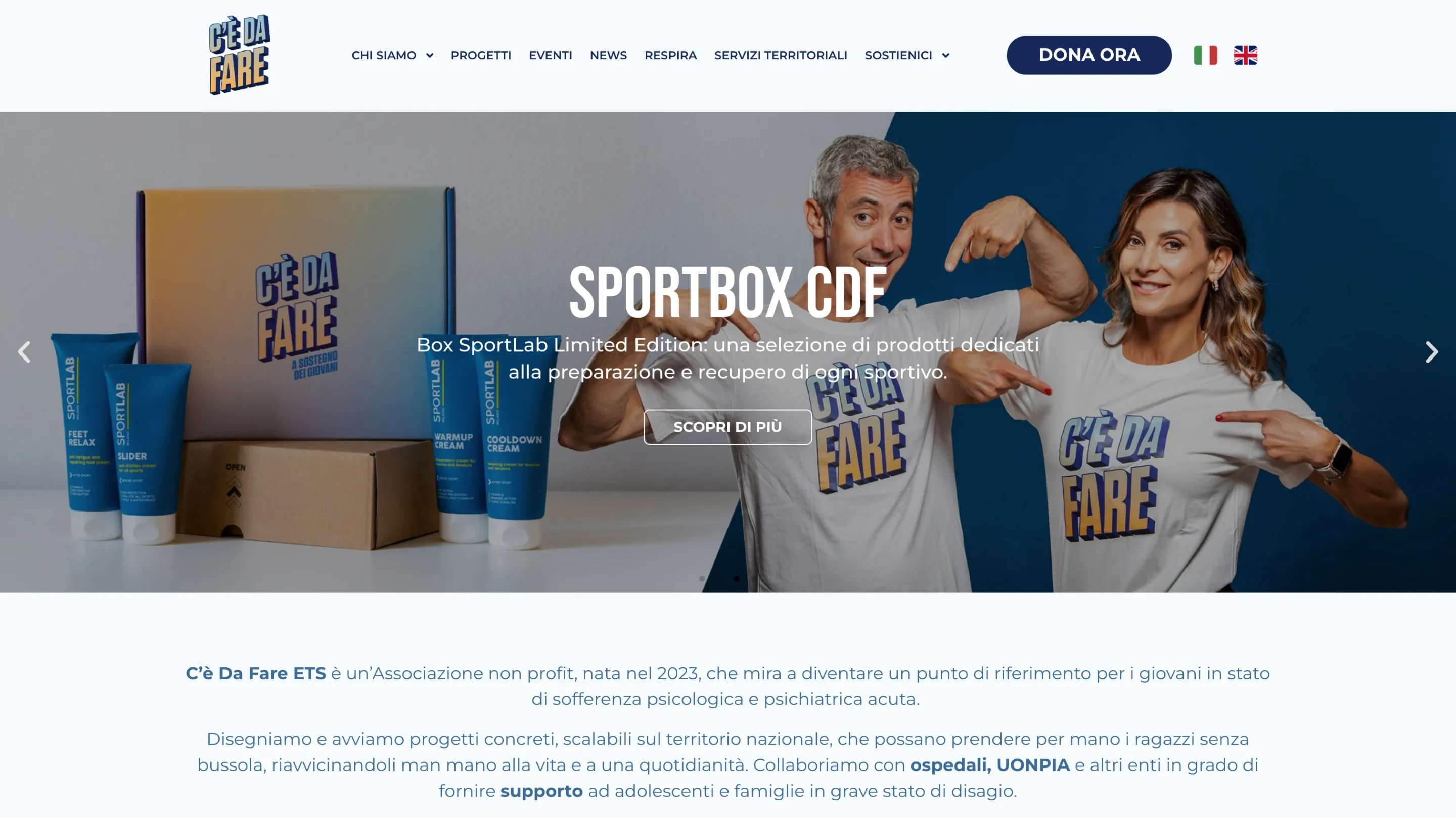
A sensitive subject. Many different audiences. One site to understand, get involved and help.
C'è Da Fare is a non-profit that supports projects focused on teenagers' psychological and psychiatric health. The website was rethought and built from scratch to explain its work clearly and turn interest into action.
C'è Da Fare was founded in 2023 and works alongside hospitals and local organizations to support young people facing psychological and psychiatric difficulties.
The association brings together very different people: families, donors, partner companies and people taking part in fundraising events. The website had to speak to all of them without losing clarity.
Talking about mental health without scaring people. Without trivializing it. And without stopping at words.
The website had to inform and welcome, but also get people to take action: discover the projects, join an event, donate or support the association.
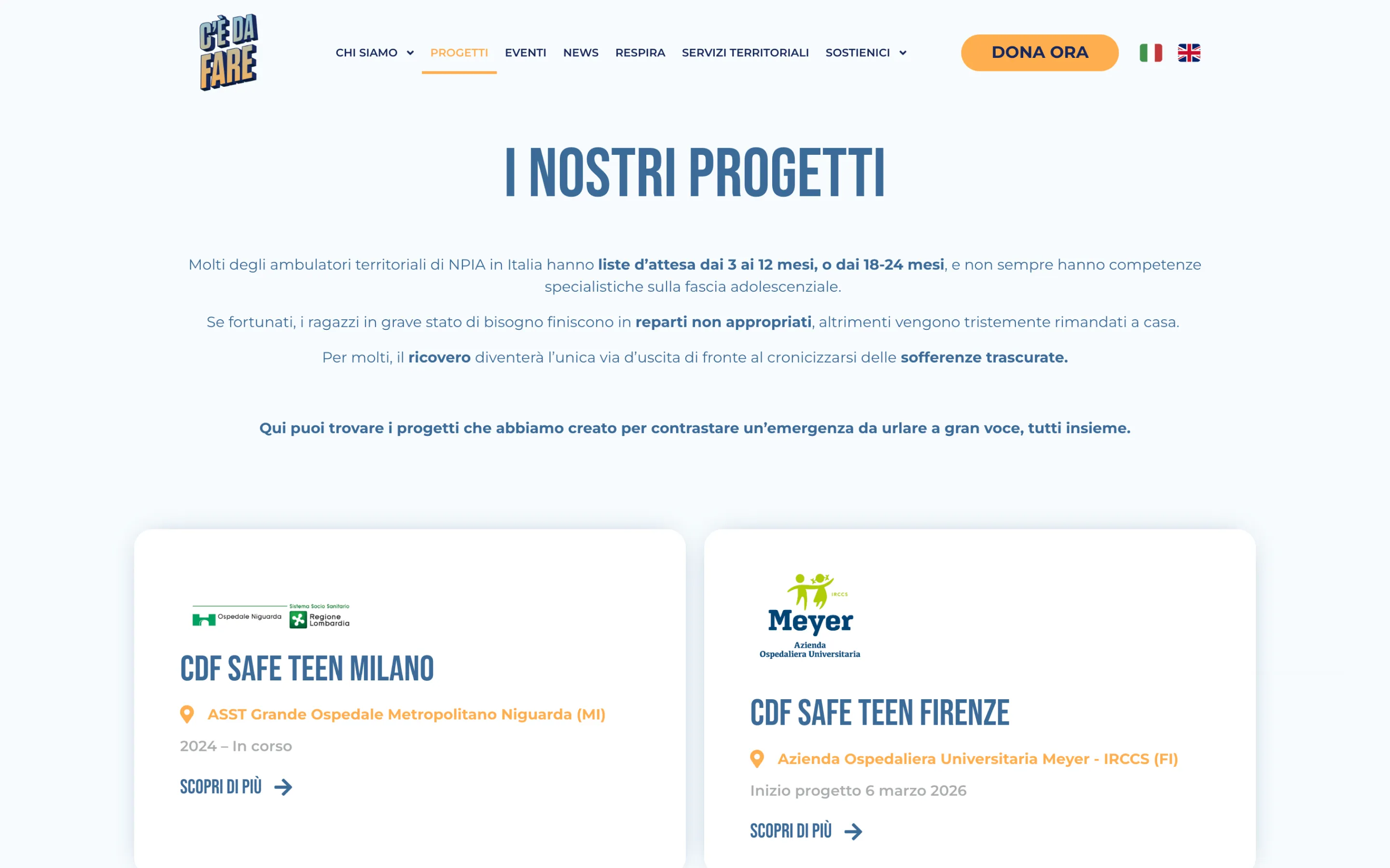
Support, always within reach.
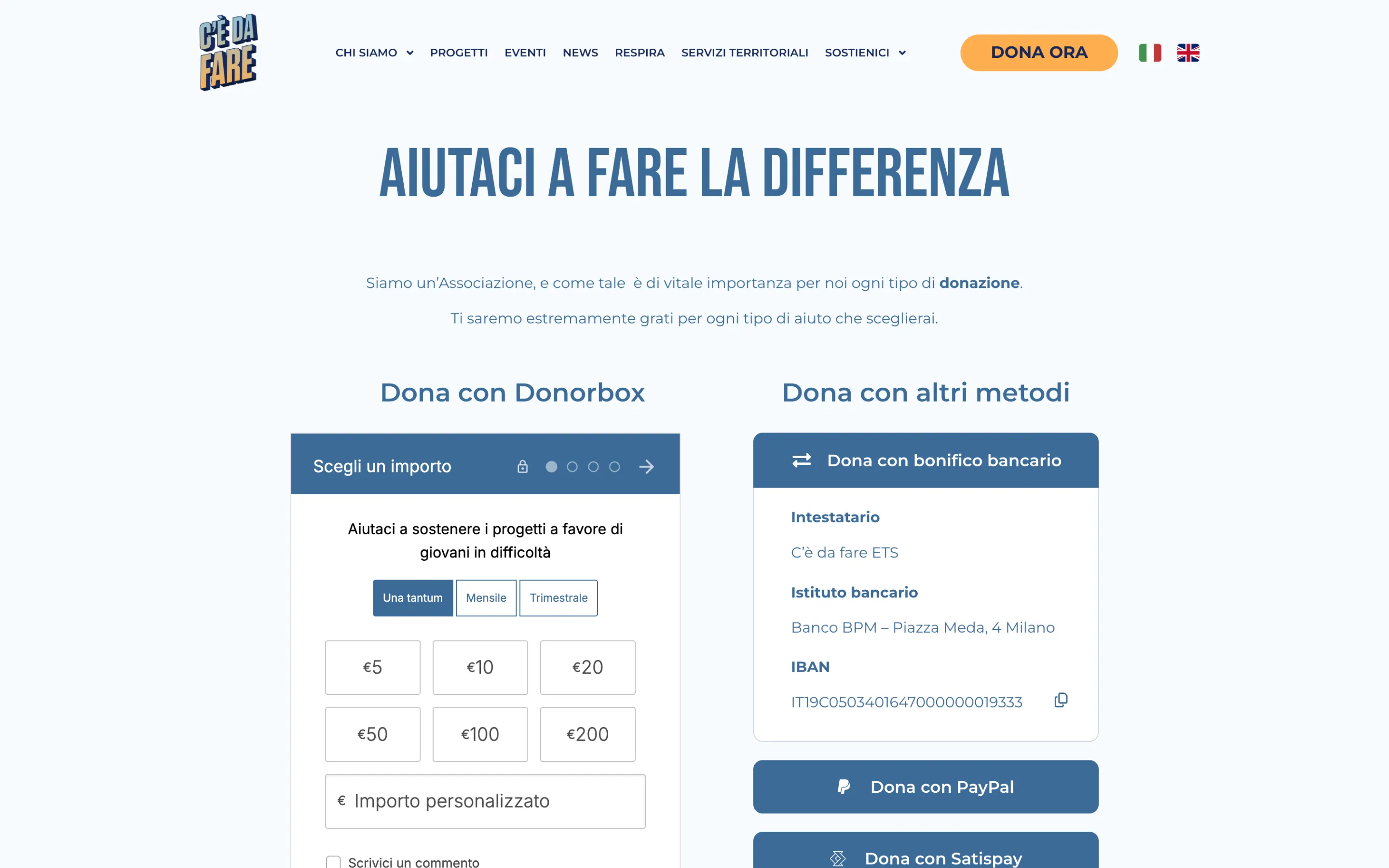
Events as a way in.
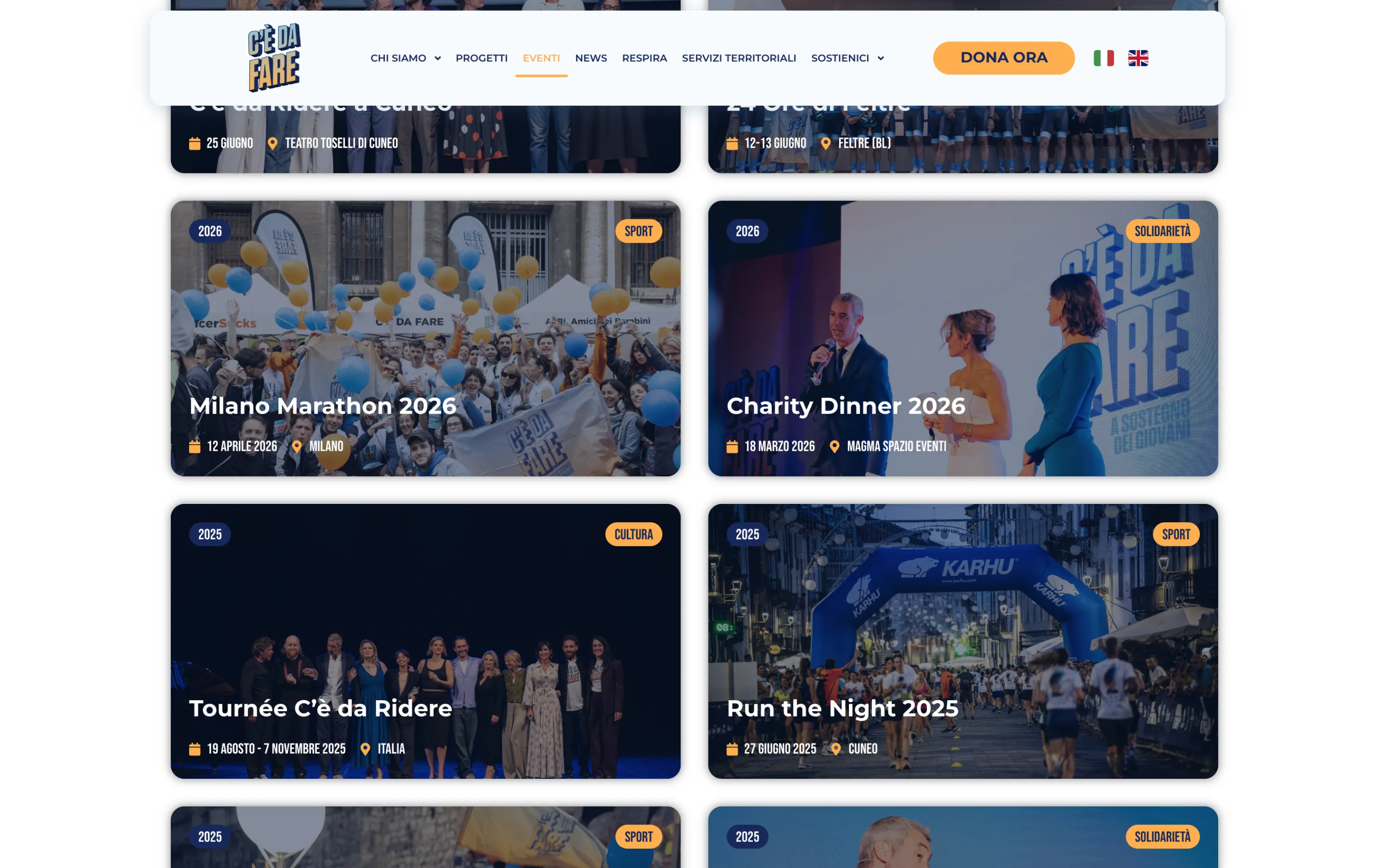
A website that makes the next step clear.
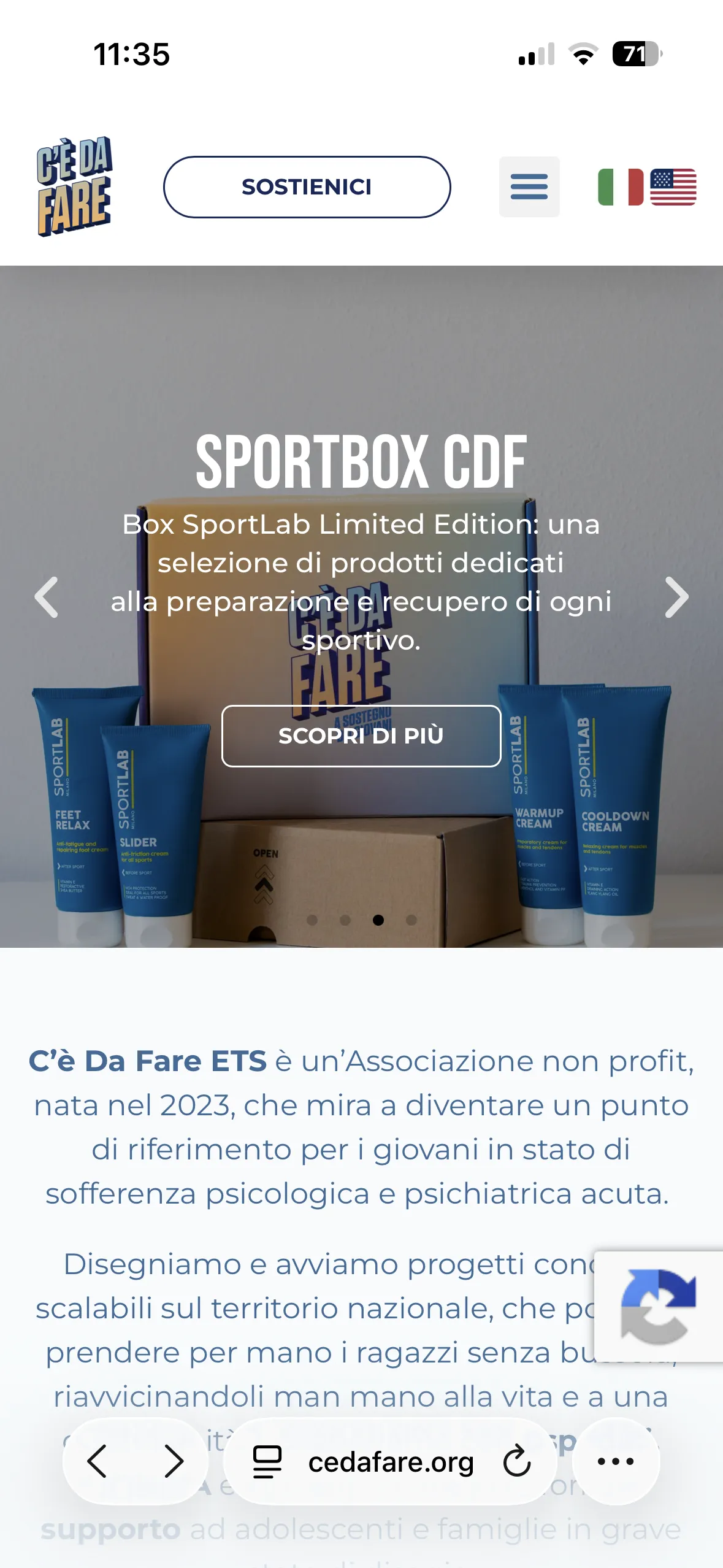
One place to tell the story of the projects, give events visibility and make support easy to find. Without losing the human tone C'è Da Fare uses to talk about young people's mental health.
Brand identity
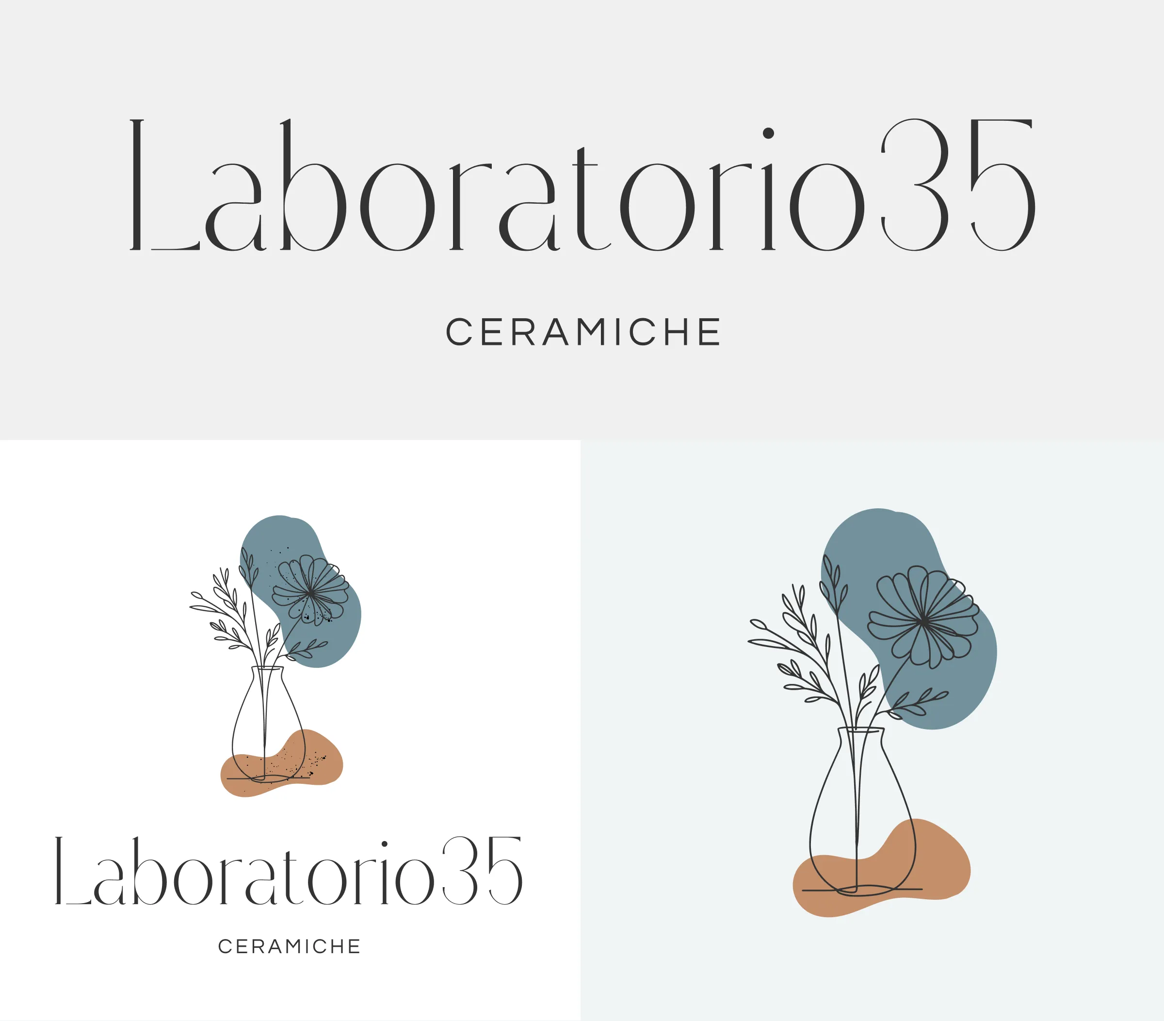
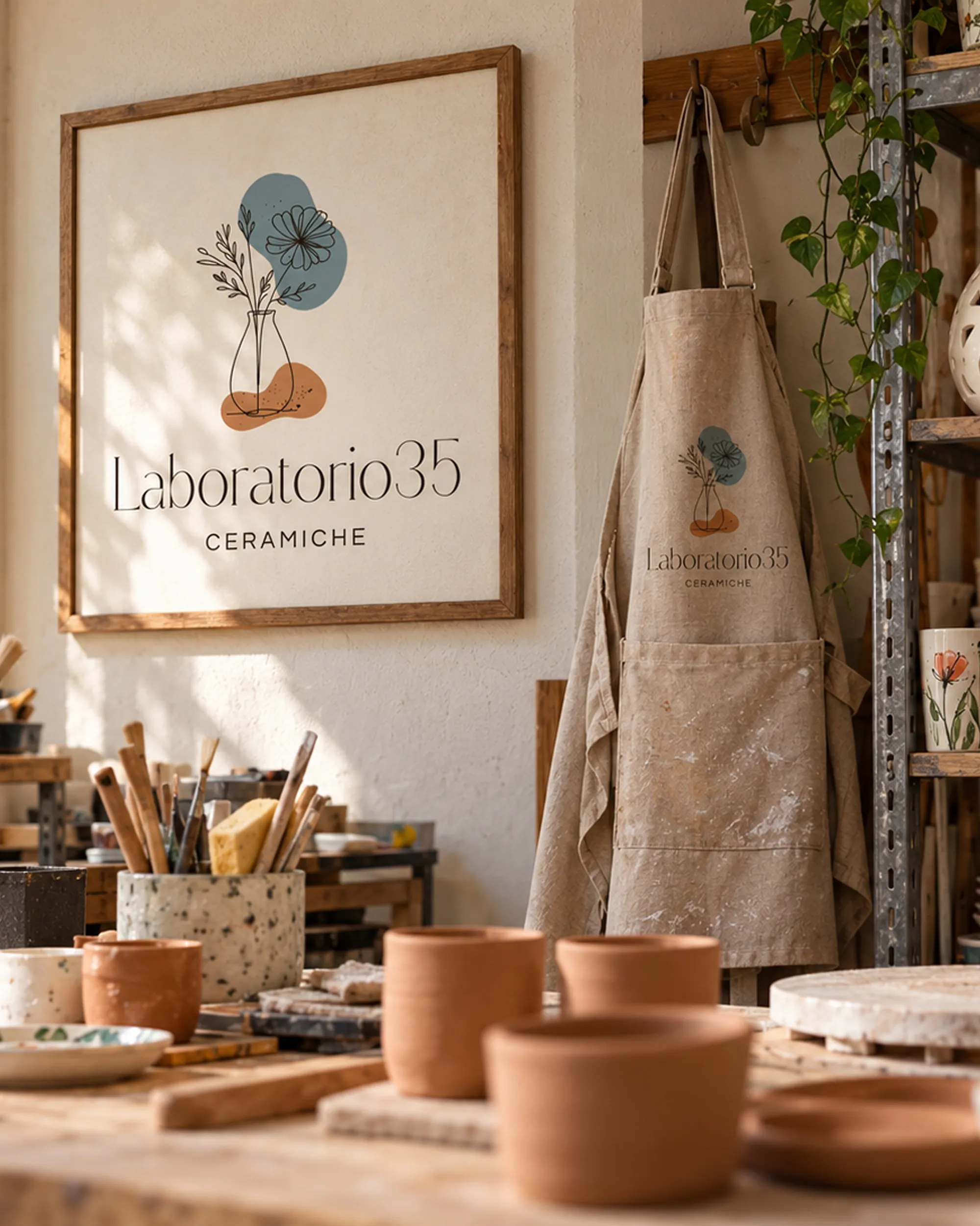
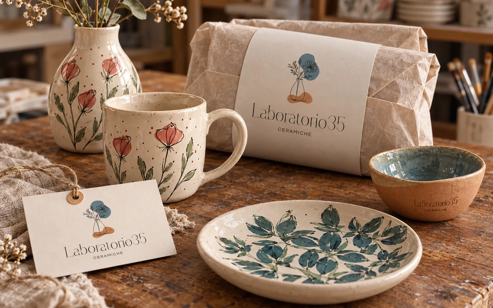
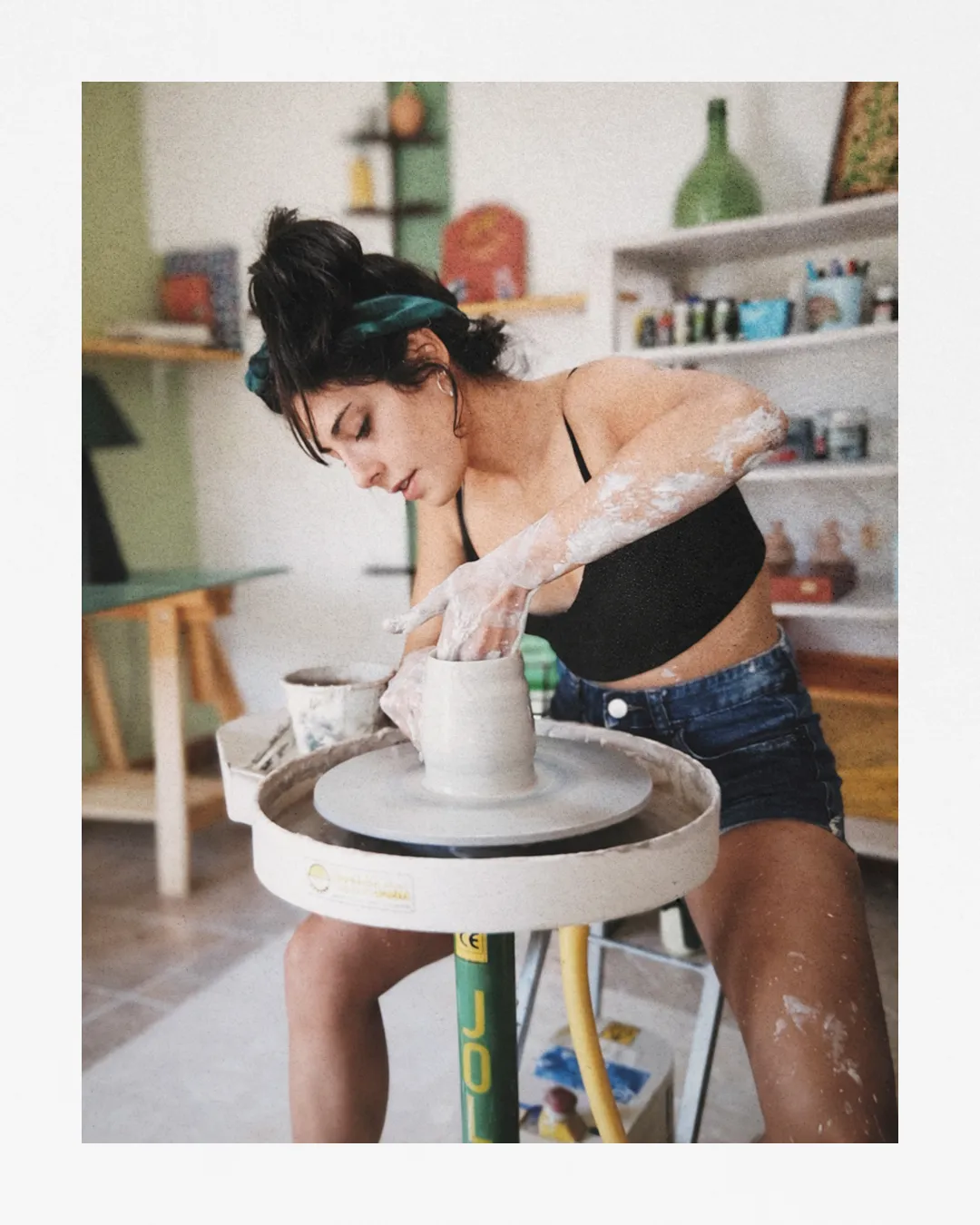
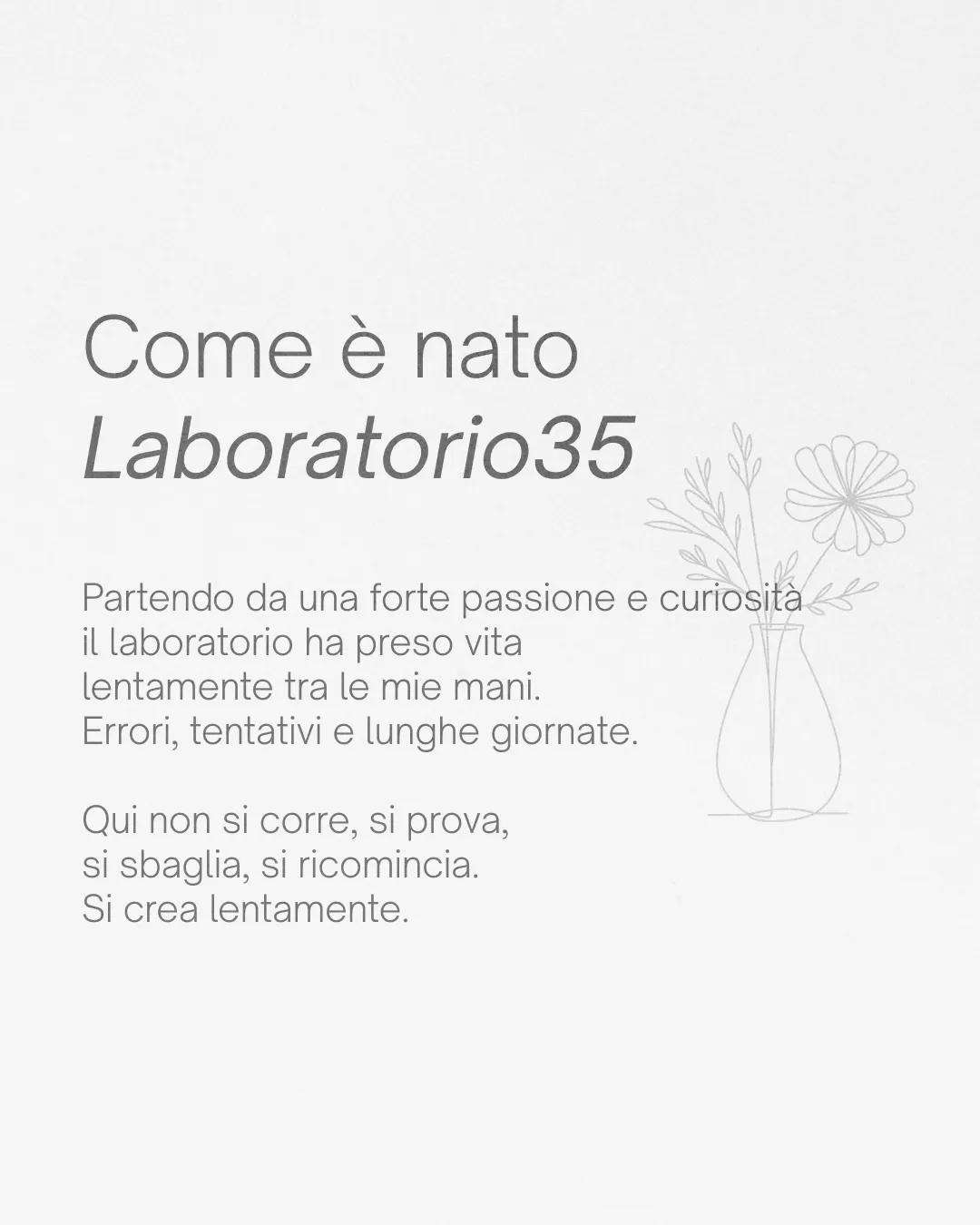
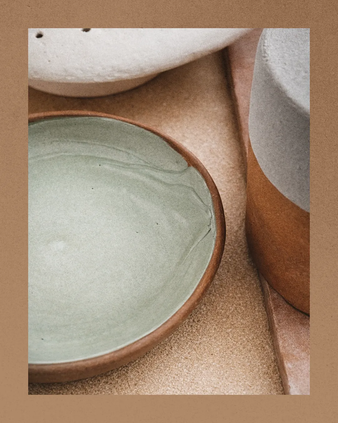
The identity of a handmade ceramics studio. A brand that had to show the same care as the product: essential, but with the mark of the hand, able to work on labels, packaging and social media.
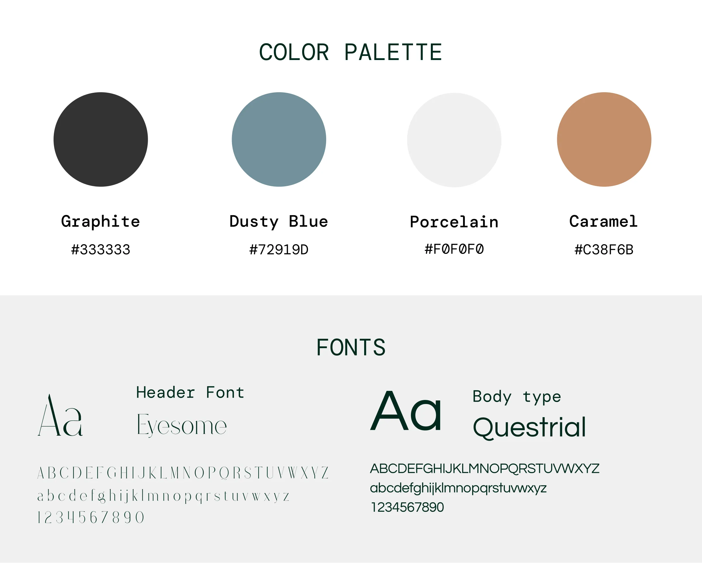
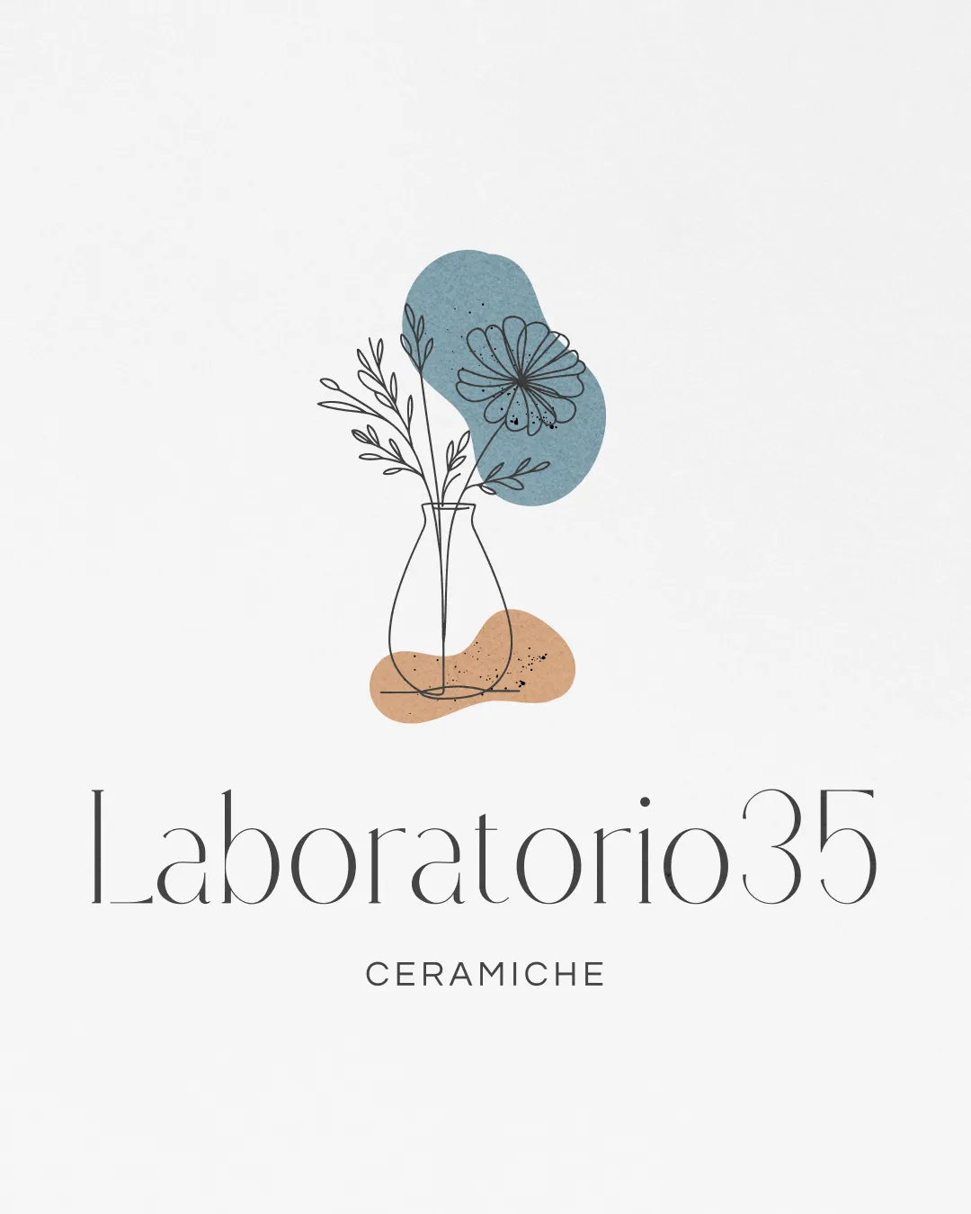
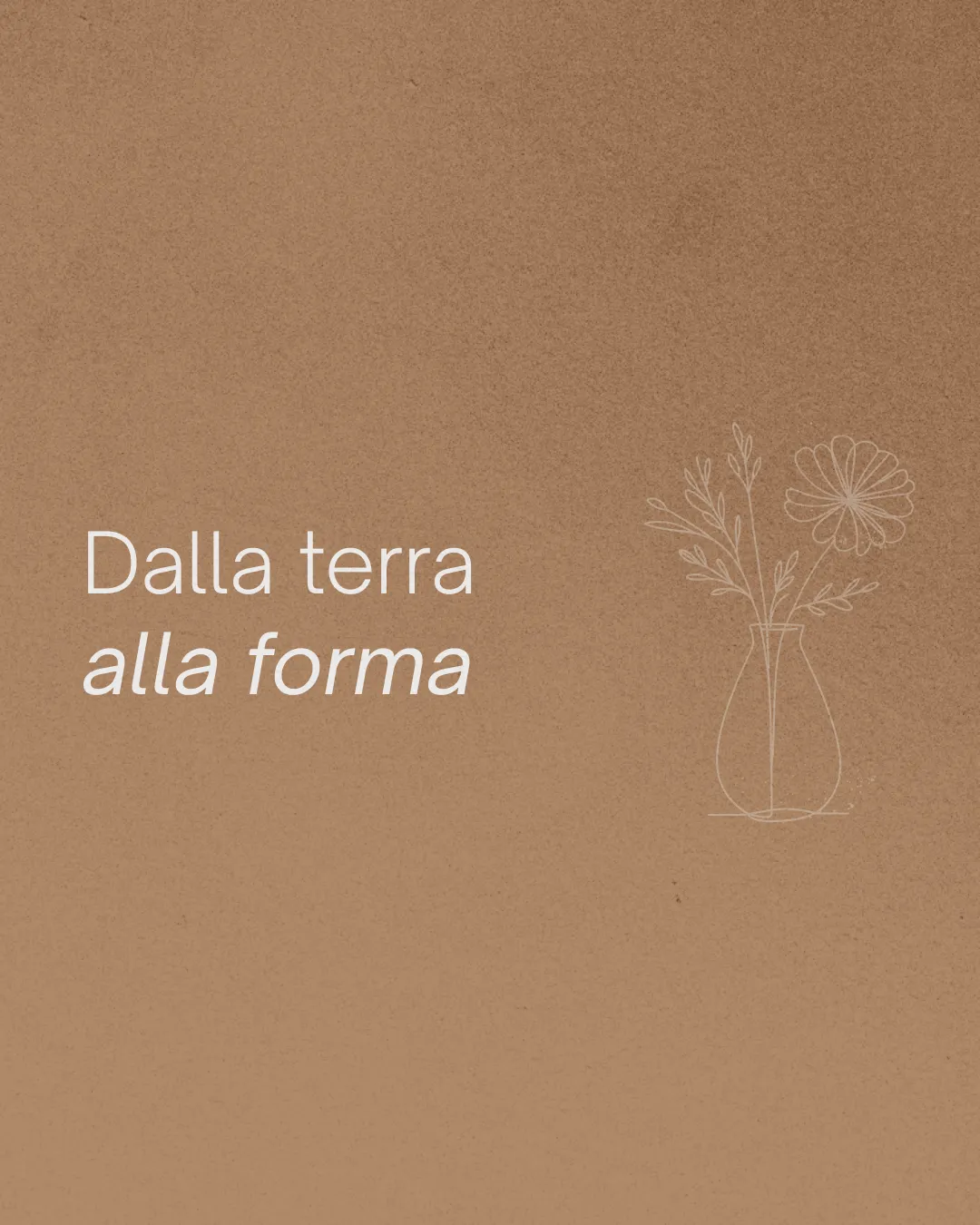
The name is the address: 35 is the studio's street number, a real place where the ceramics are made and can be seen. The symbol is a vase of wildflowers drawn in a fine line, like a mark traced by hand in clay. Behind it, two irregular patches of color: the dusty blue of the glazes and the terracotta of the clay, imperfect like every piece made on the wheel. The lettering, a fine and elegant serif, balances the irregular shapes: the precision of the craft next to the imperfection of the handmade.
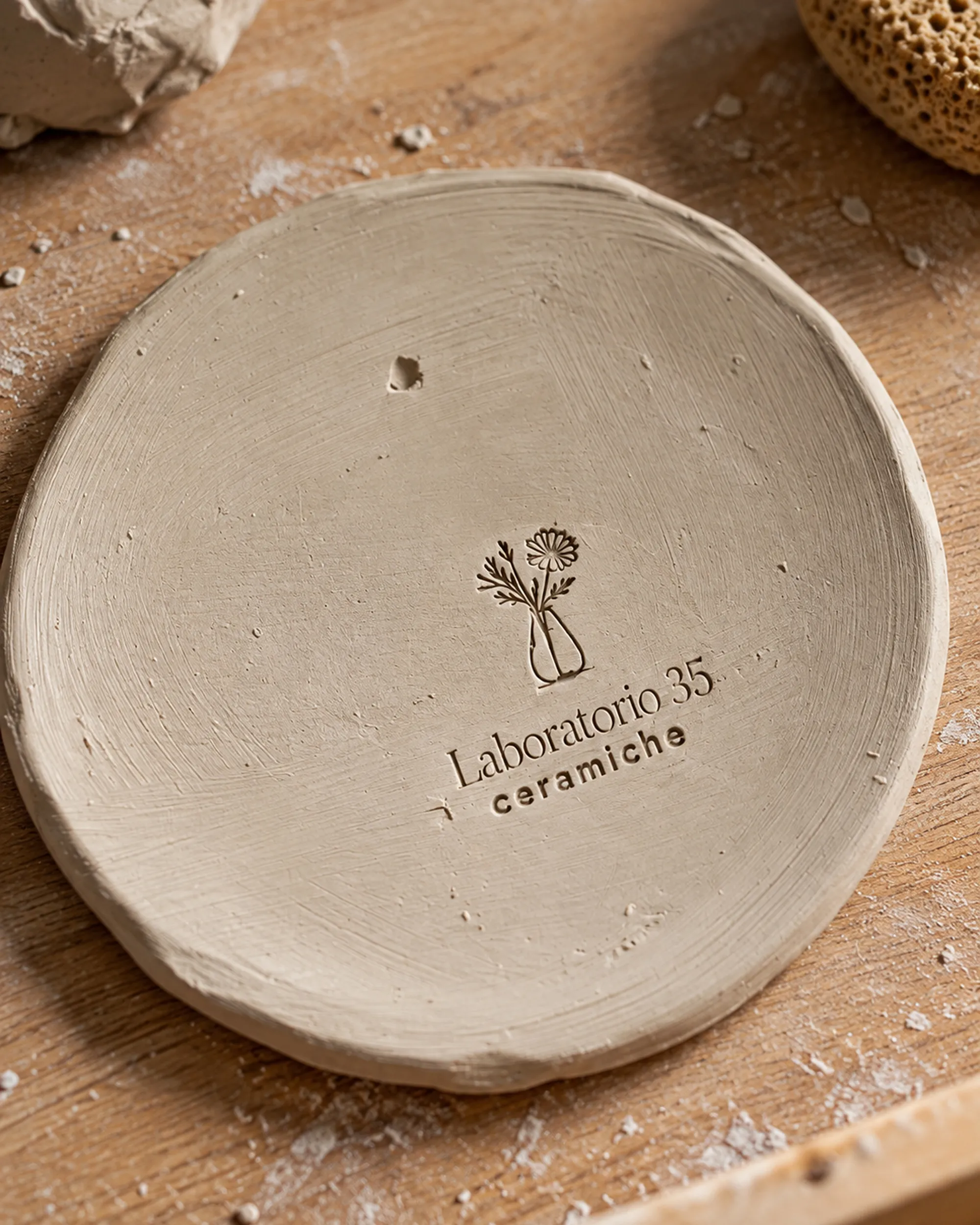
From clay to screen.
The identity is designed to work across packaging, printed materials and digital content without losing the workshop's character.
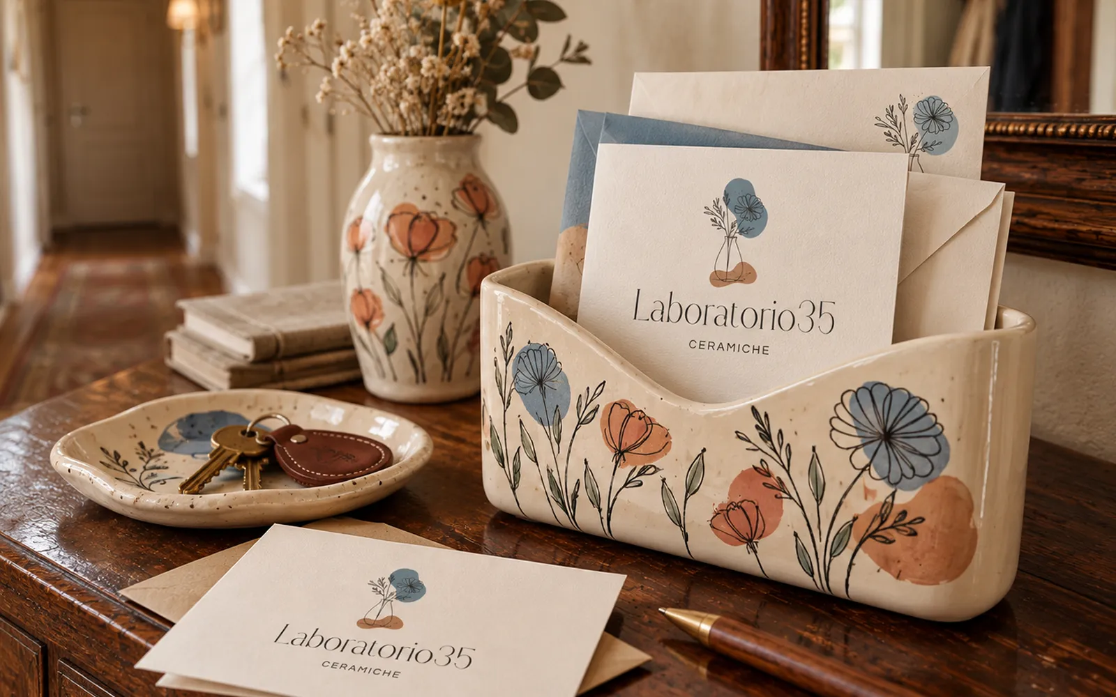
Same identity. New content.
Instagram is part of the system too. The profile is looked after over time, post by post, so every new piece of content still feels unmistakably Laboratorio35.
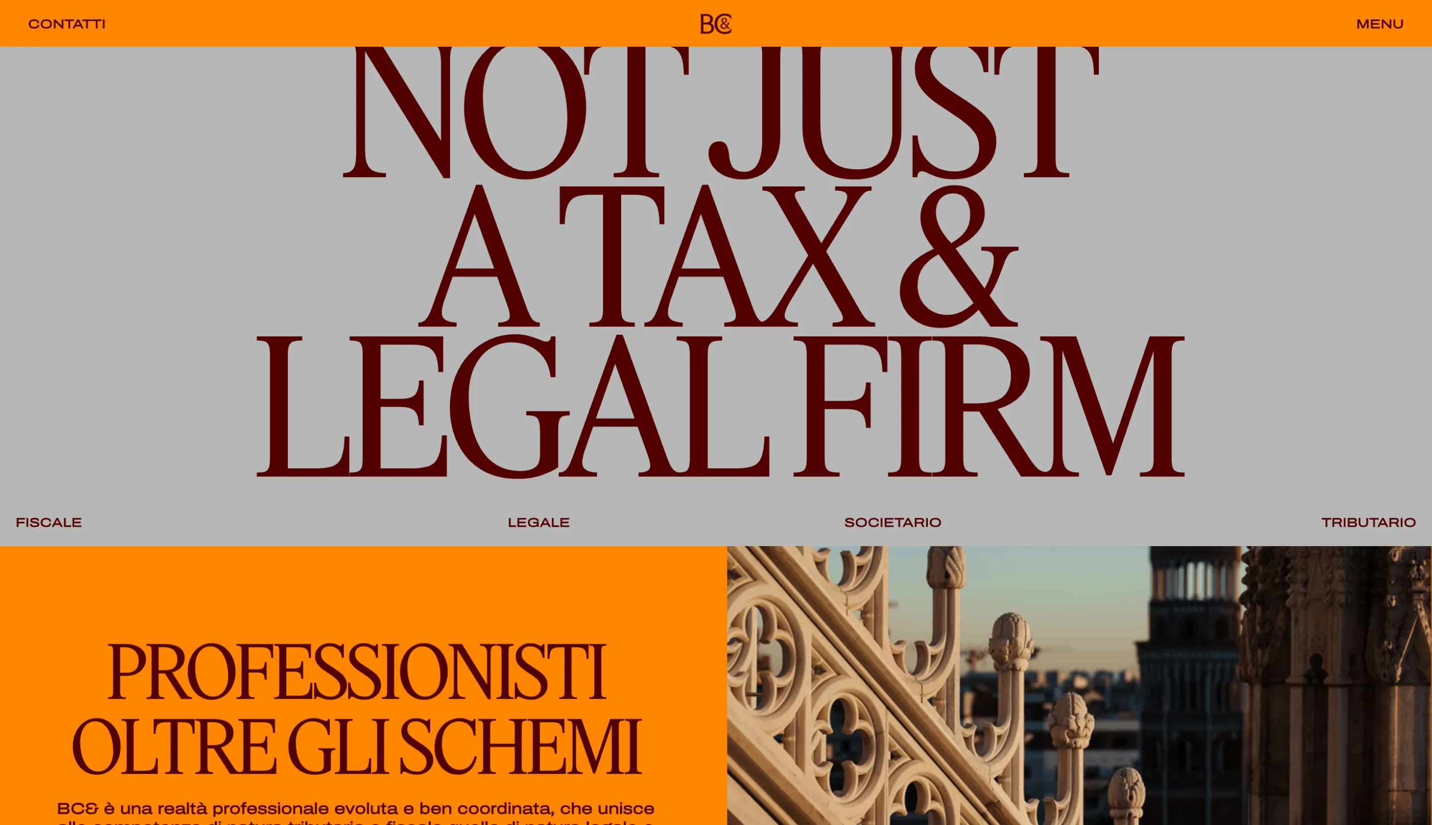
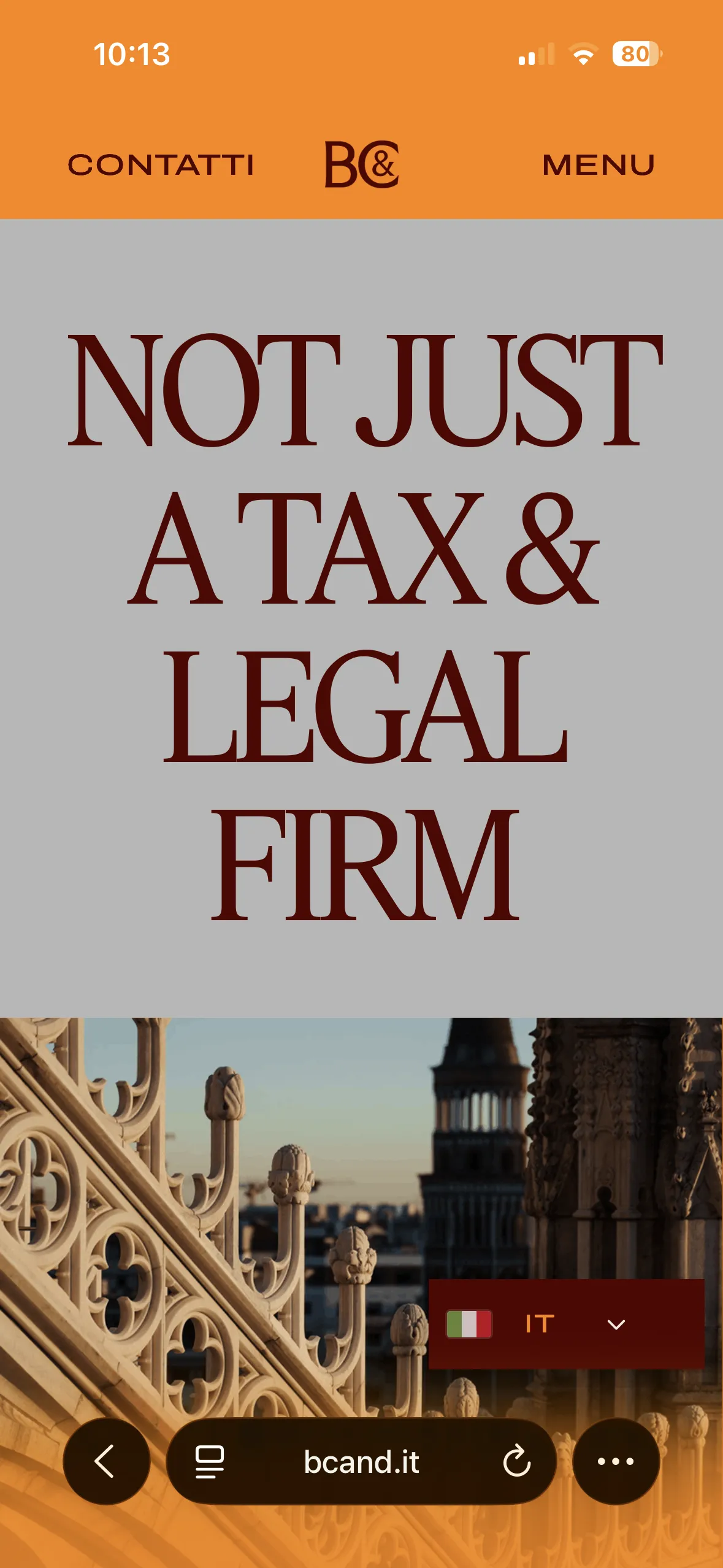
A bold design. Built without toning it down.
BC& is a Milan-based tax and legal firm that calls itself “not just a tax & legal firm”. Its new design, by IMille, deliberately breaks with the usual look of the industry.
Naki developed it end to end: WordPress handles the content, while layouts, components, interactions and animations are custom-made.
BC& wanted a website far from the traditional image of a professional firm: expanded type, bold colors, a manifesto on the homepage and plenty of motion.
Behind such a distinctive front end, though, it needed something much simpler: a system that let the firm update news, people and services on its own.
Complex in the front. Simple in the back.
Pairing an experience full of custom interactions with a CMS that's easy to use. Without compromising the design, and without asking the client to touch the code.
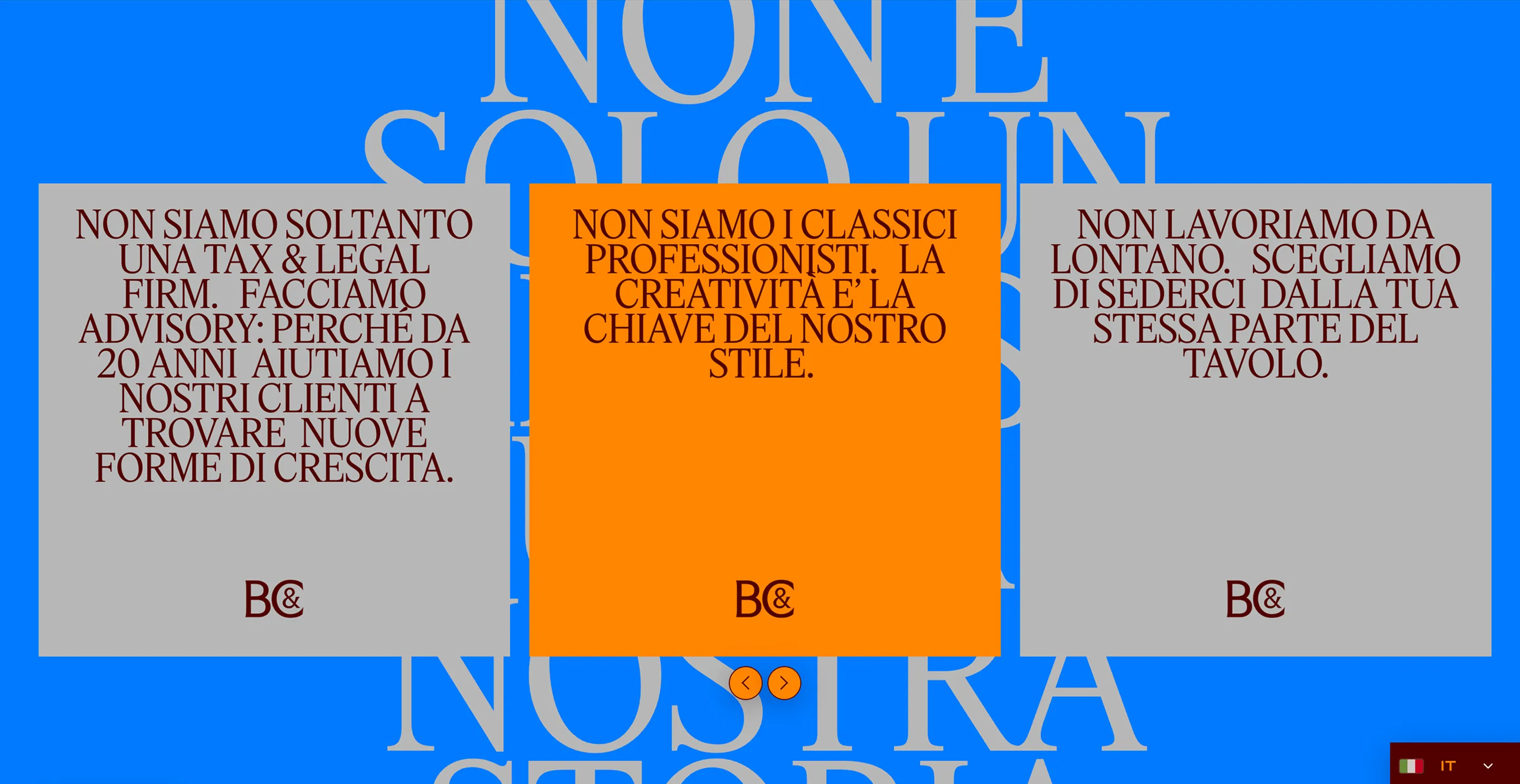
A CMS where it's needed. Code where it counts.
Editable, not breakable.
Alphabetical. Actually alphabetical.
The brochure. Without the PDF.
WordPress is the CMS. Not the design tool.
A heavily custom front end with a back end that's simple to manage. The design stays intact, while the content can keep changing.
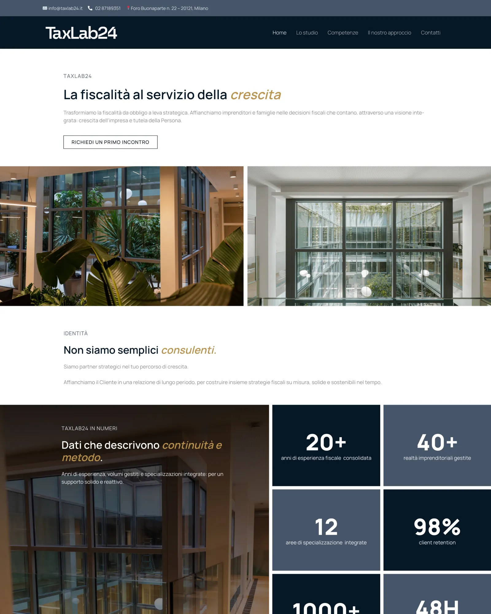
A new firm. With years of experience behind it.
TaxLab24 was founded in 2024, built on the long-standing experience of the professionals behind it. The website was designed and built from scratch to give that balance a digital form: new in how it presents itself, solid in how it works.
TaxLab24 works with entrepreneurs and families, and starts from a clear idea: tax isn't just an obligation to deal with, but part of making better decisions.
The firm was new. The experience behind it wasn't. The website had to get both across.
Look established. Without looking like everyone else.
Giving a brand-new firm the authority of an established one, without slipping into the cold, institutional, interchangeable look of so much tax communication.
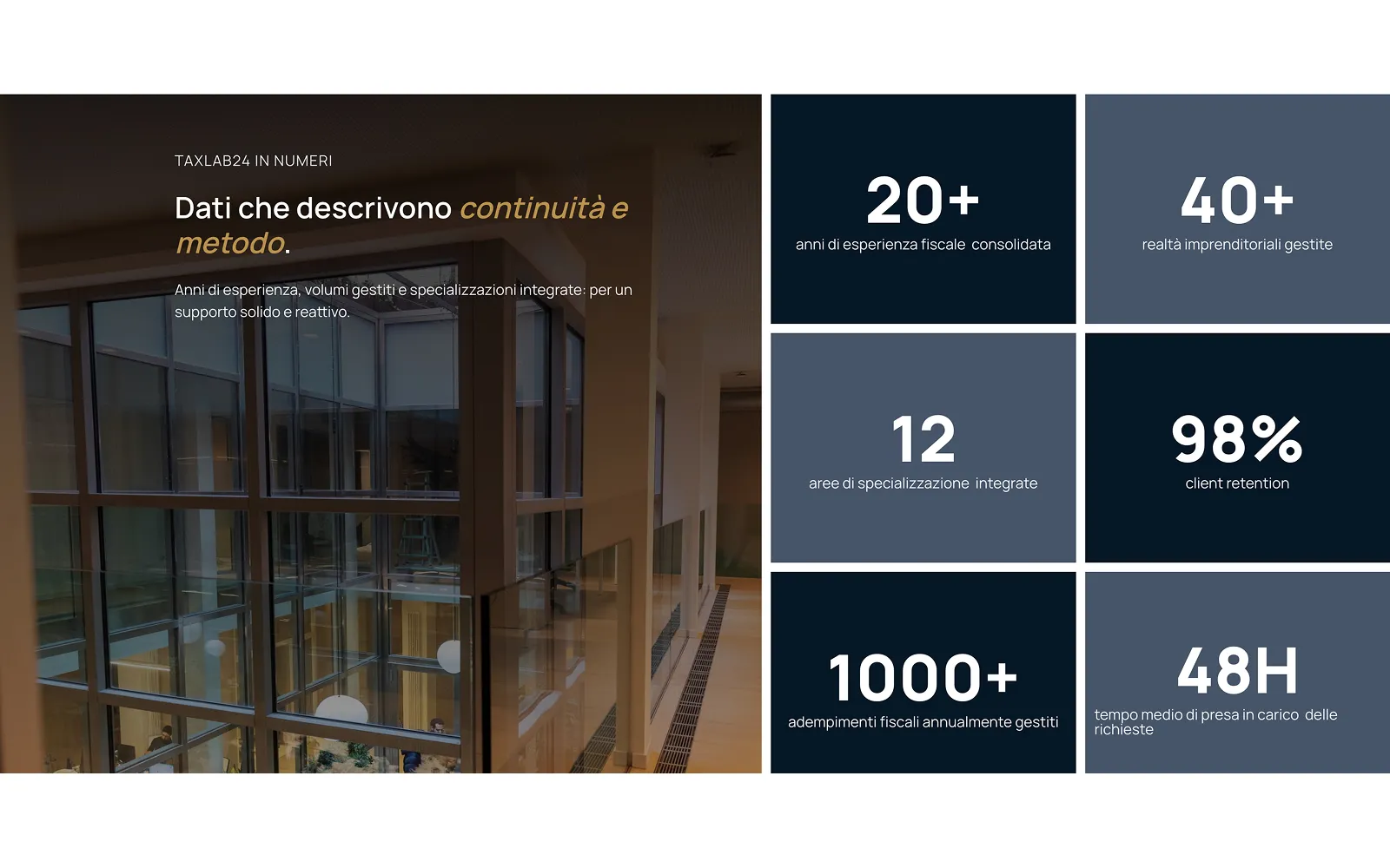
Trust, without the corporate clichés.
Authoritative, not distant.
Concrete, above all.
A clear path.
A new firm. Not new to this.
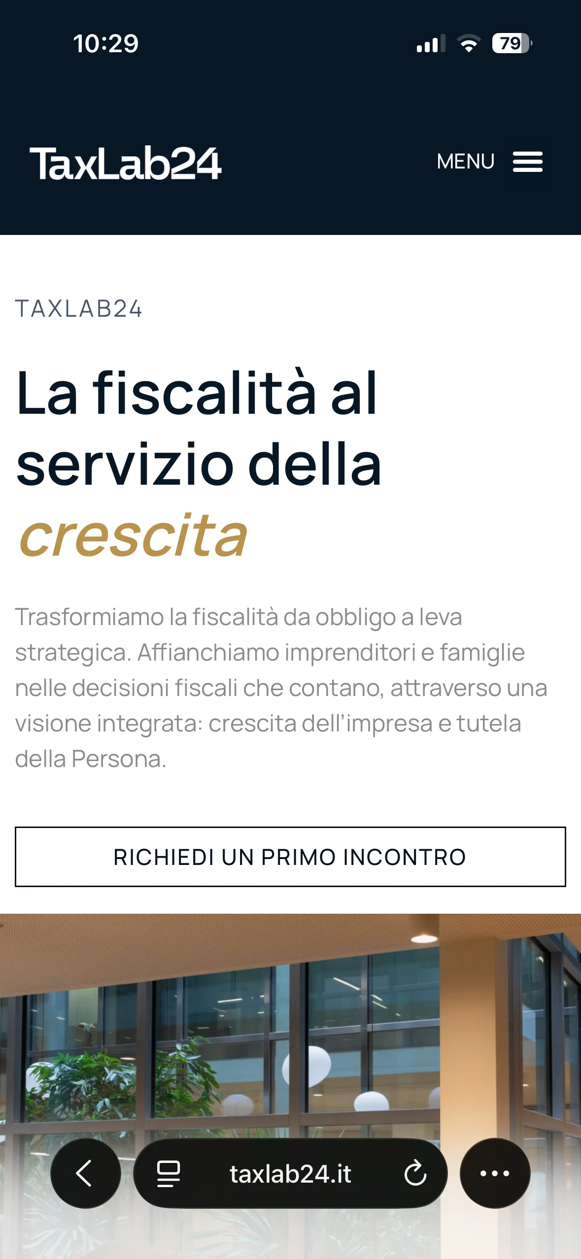
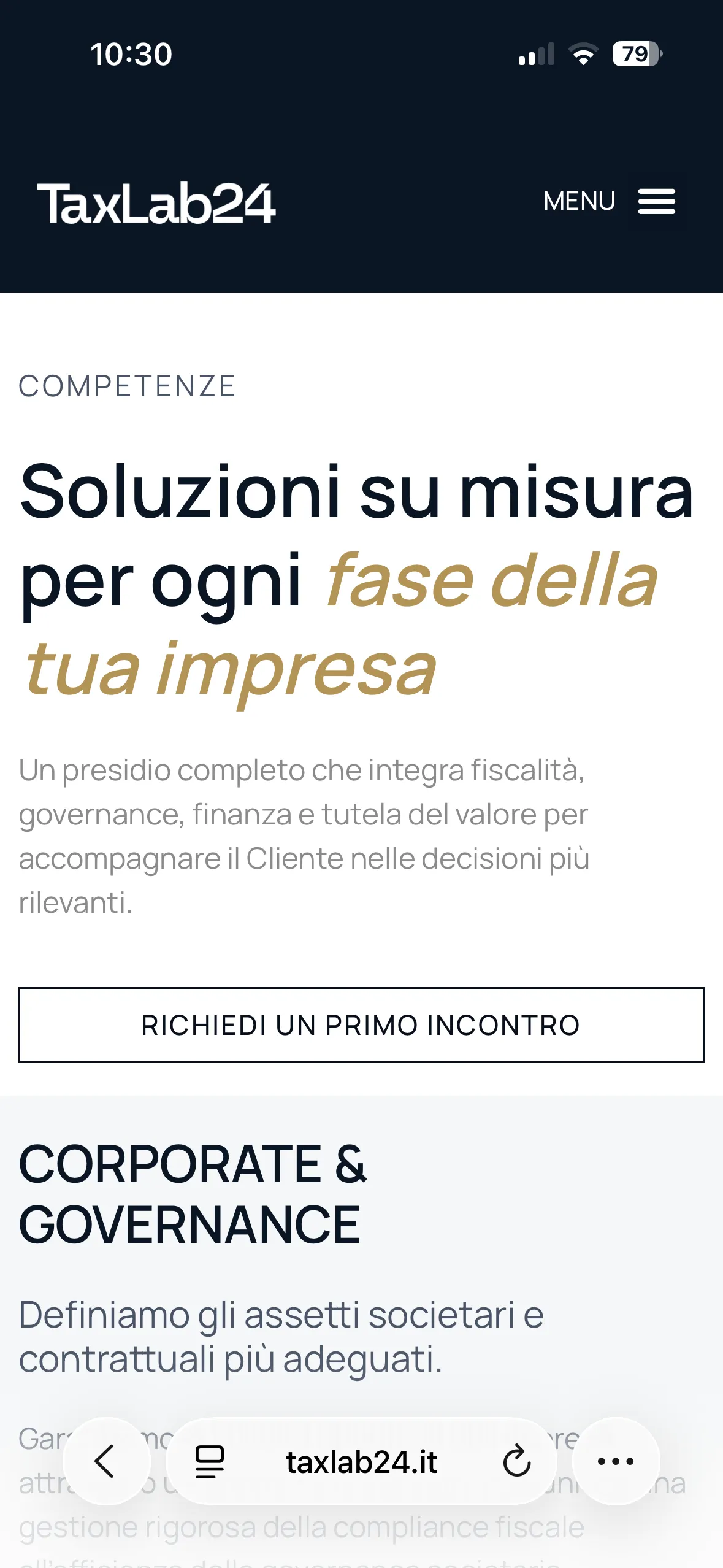
A website that presents TaxLab24 for what it is: a young firm led by experienced professionals. Clear to read, easy to get in touch with, simple to manage.
Brand identity
Good, simple, and full of character.
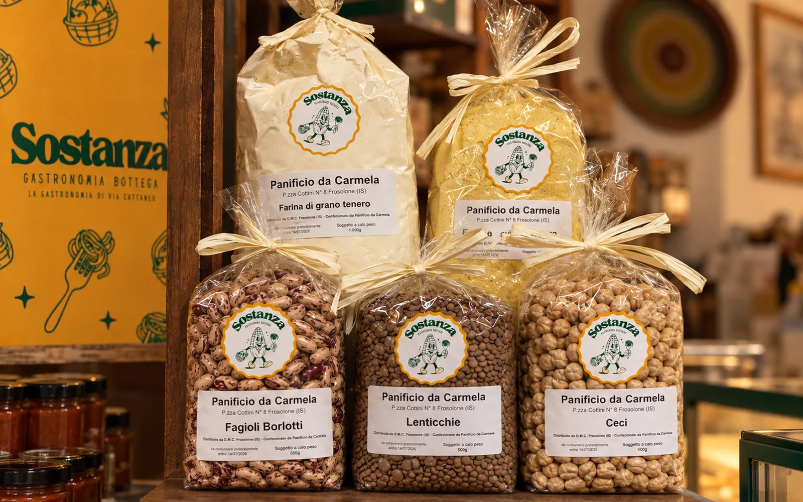
Sostanza is a deli and shop in Brescia: carefully chosen products, ready-made dishes and good things to take home. The identity starts from the same idea: no frills, but enough personality to stick in your mind.
Sostanza looks to the neighborhood shops of the past without trying to imitate them. The idea was to build something familiar, direct and a little cheeky: contemporary, but with one foot in the visual culture of old Italian shop signs.
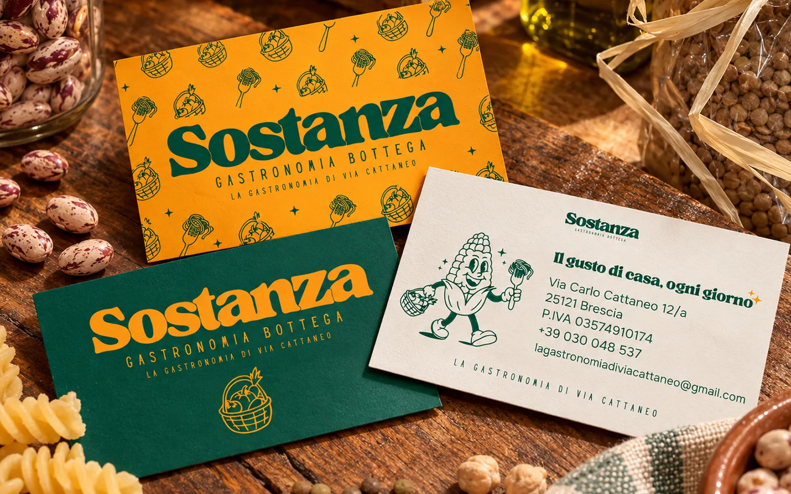
The corn recalls polenta and simple cooking rooted in the region; the soft, full lettering echoes the character of hand-painted signs. Green and orange do the rest: garden, warmth, appetite.
A corncob with its hands full.
At the center is a corncob drawn like a 1930s cartoon character. Its basket holds the shop's products, its fork whatever comes out of the kitchen: both sides of Sostanza in a single mark, designed to live well beyond the logo.
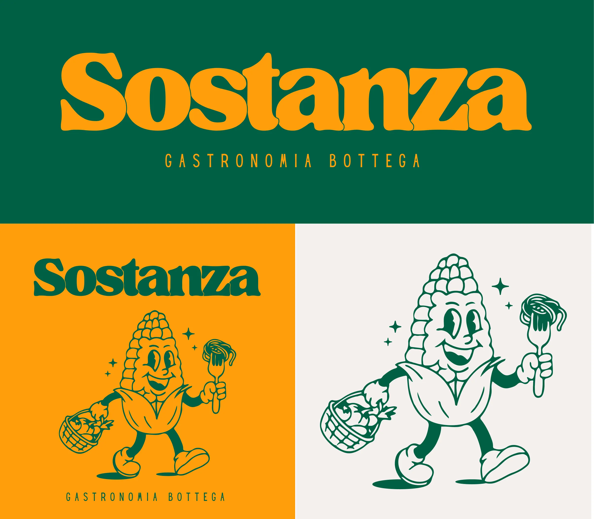
Old-school flavor. New-school system.
A mascot, lettering, a very bold palette and a set of graphic elements build an identity that's deliberately down-to-earth, but never nostalgic. Everything can change format without losing Sostanza's tone.
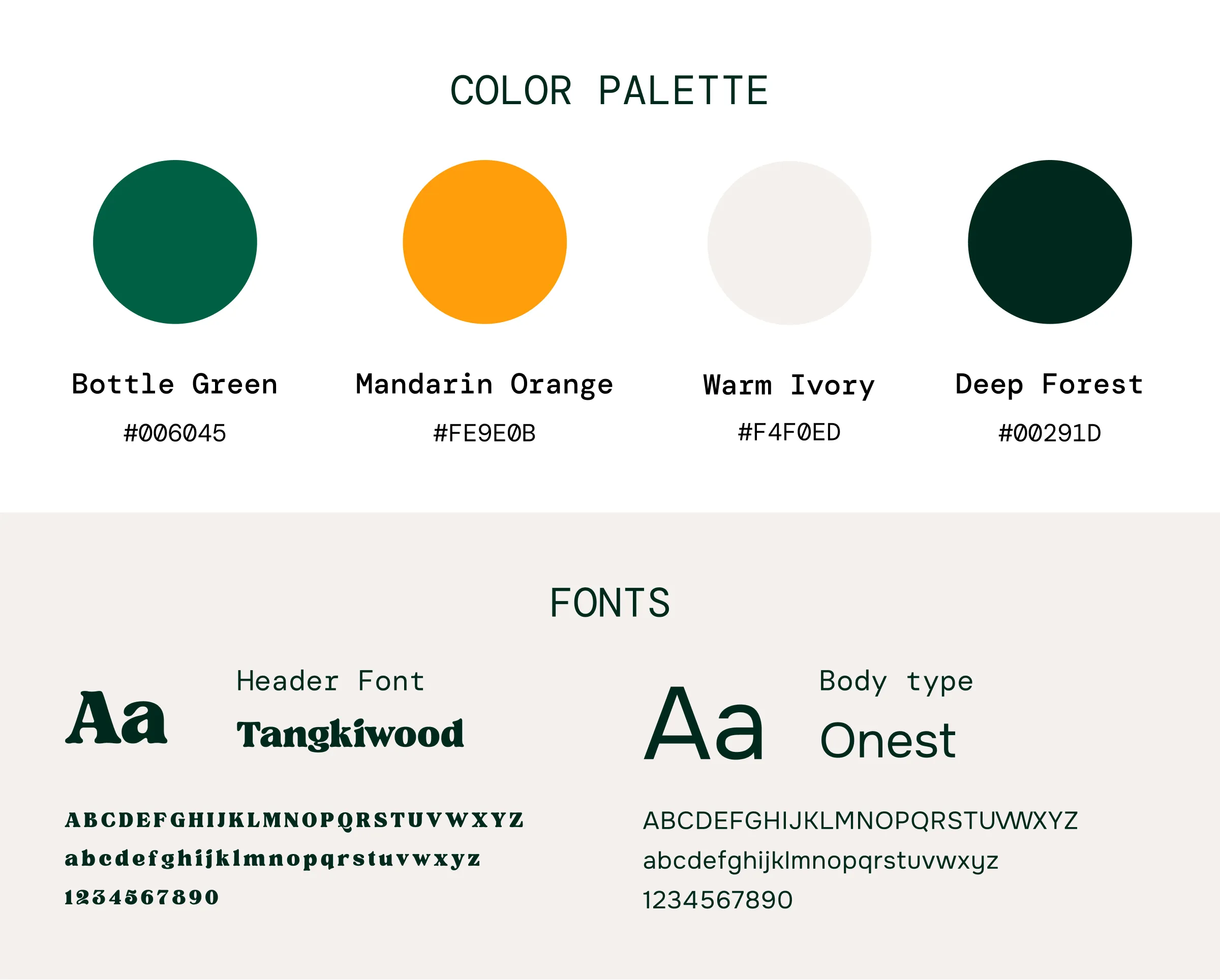
No frills. Just Sostanza.
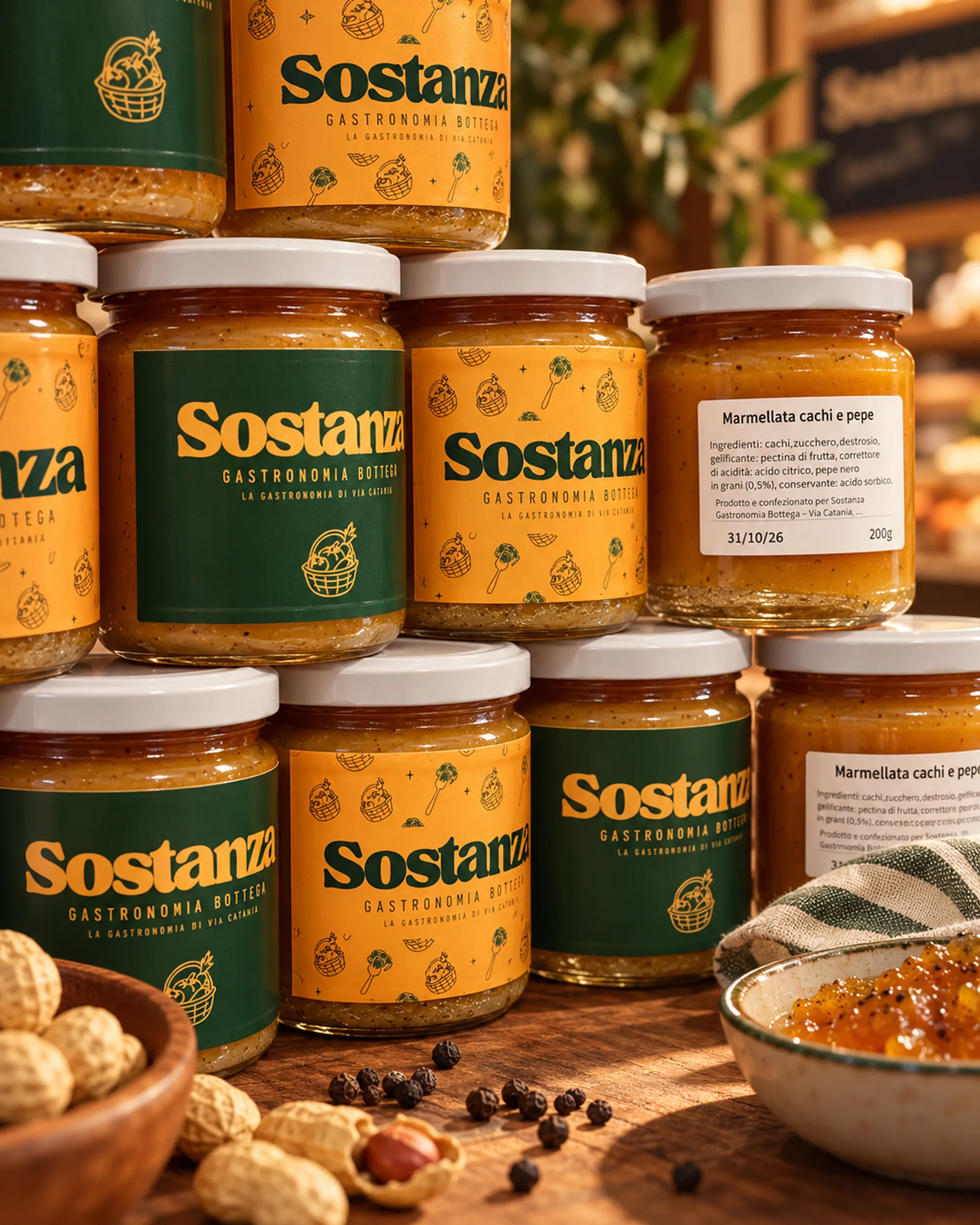
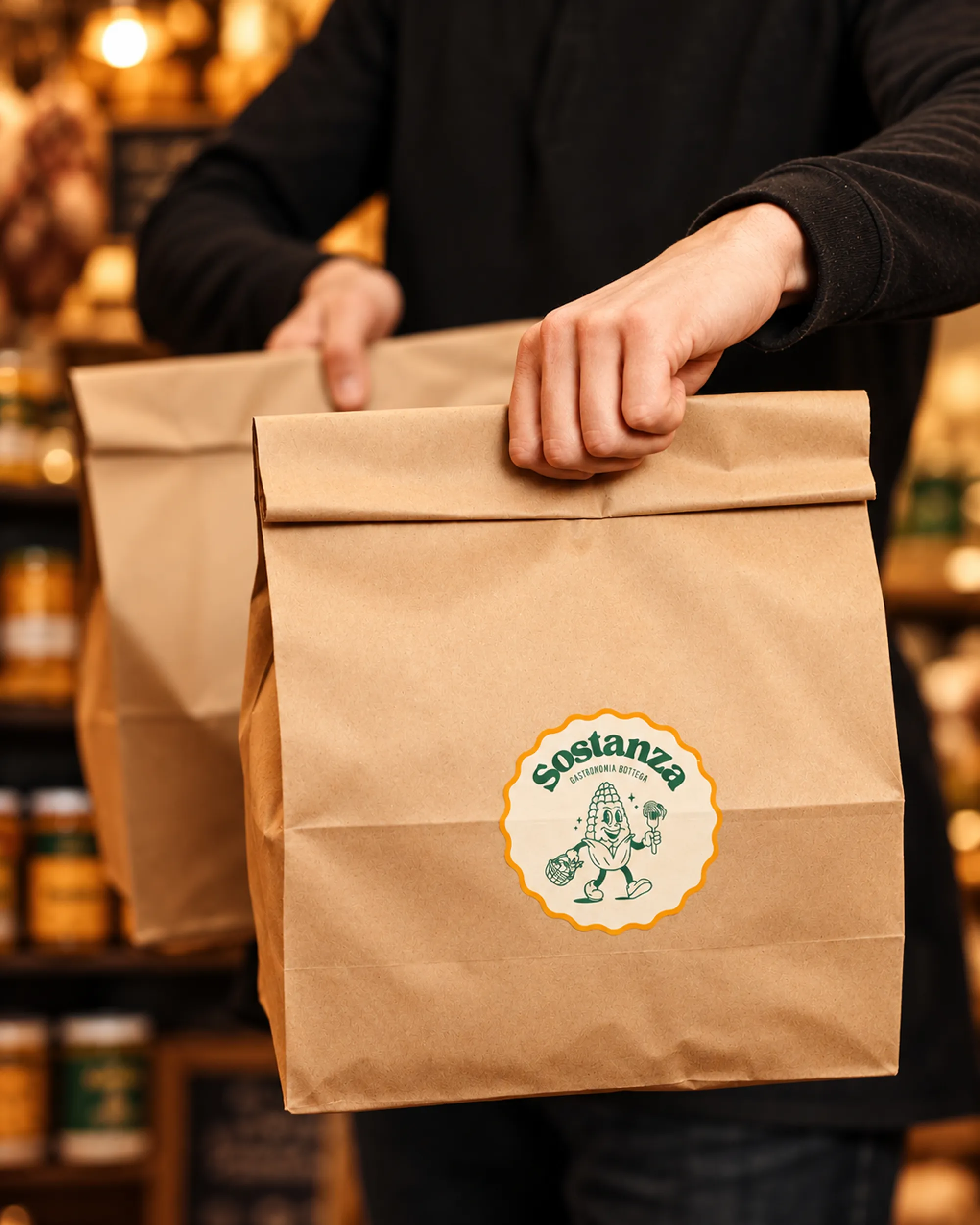
An identity designed to live on the real things a shop is made of: the sign, labels, food wrapping paper, packaging, printed materials and social media.
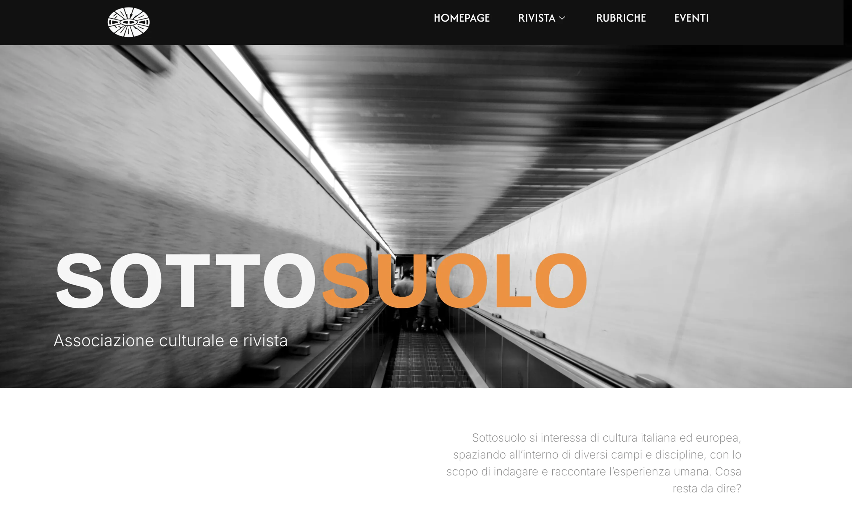
A magazine should feel like a magazine. Even in the browser.
Sottosuolo is a cultural association founded in Milan in 2024 by a group of students. It lives across a magazine with themed issues, online columns and events.
The website was redesigned to bring that same editorial voice online: in the topics it covers, the pace it sets, and the way readers move through it.
Sottosuolo isn't just a magazine, and it isn't just an association. Issues, articles, columns and events share the same project, and they move at very different speeds.
The website had to hold them together without blending them into one indistinct stream of content.
Not another online magazine.
Bringing Sottosuolo to the web without flattening its editorial character. The site had to be easy to explore and update, while keeping the rhythm, hierarchy and personality of a designed magazine, not just a feed of articles.
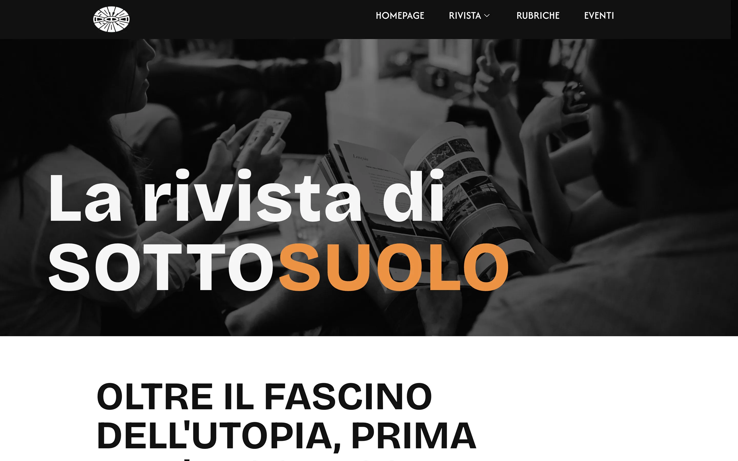
Three rhythms. One voice.
The magazine stays at the center.
Columns have continuity.
Events take the project off the screen.
There's always more underneath.
A website that holds the magazine, columns and events together, and gives every piece of content room to be read. Just like a magazine should.
Brand identity
A place first. A brand second.
L'Oasi nel Borgo is a vacation home in Monteroduni, in the heart of Molise, created by restoring an old stable and hayloft.
There was no need to invent a world for the identity. Looking around was enough: stone, olive trees, greenery, quiet and small details that were there long before the brand.
The mark starts from two elements that truly belong to the house. The roof recalls the original building, an old stable and hayloft restored in the heart of the village; the watercolor prickly pear comes from the garden and is one of the first things to greet anyone who walks in.
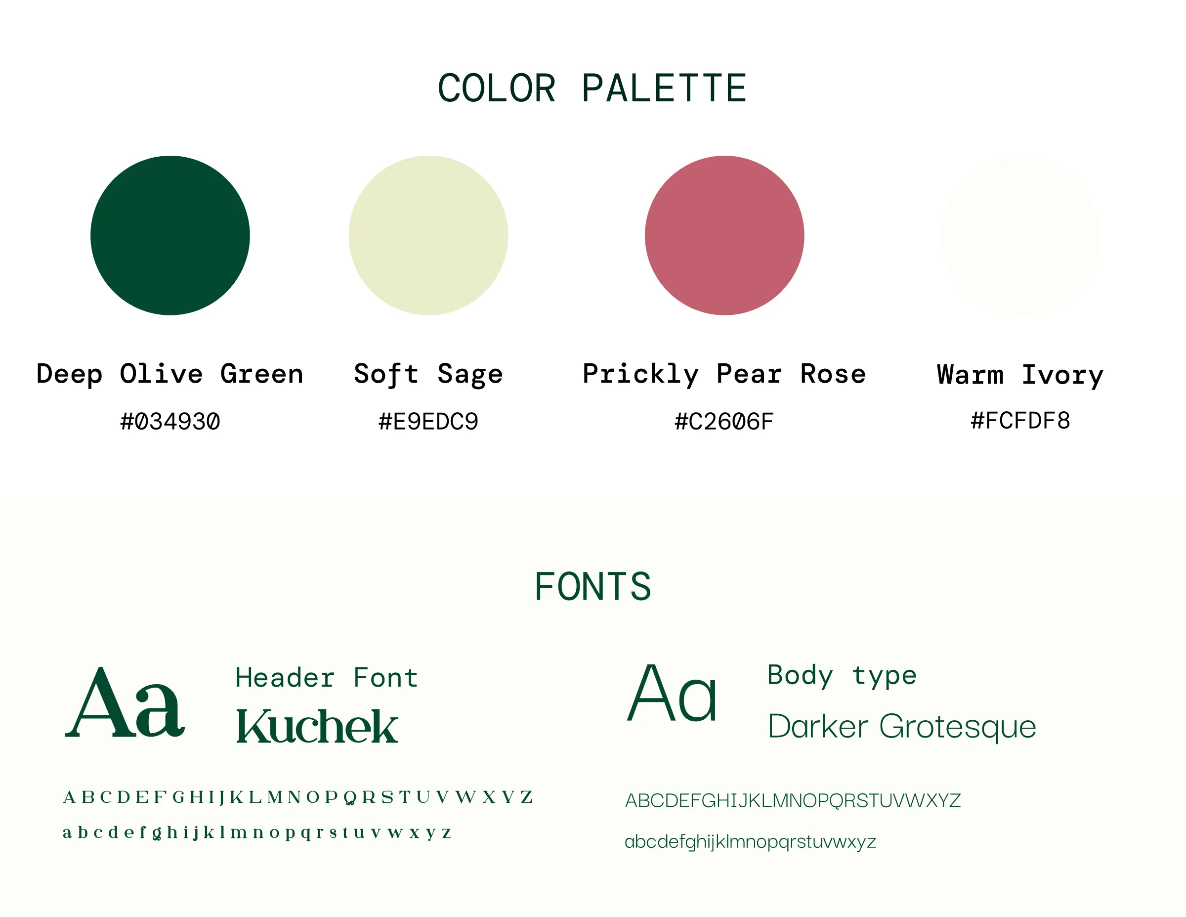
The palette takes its colors from the landscape: the greens of olive trees and sage, natural tones and a warm pink taken from the fruit. The typography completes the system, balancing softness and simplicity.
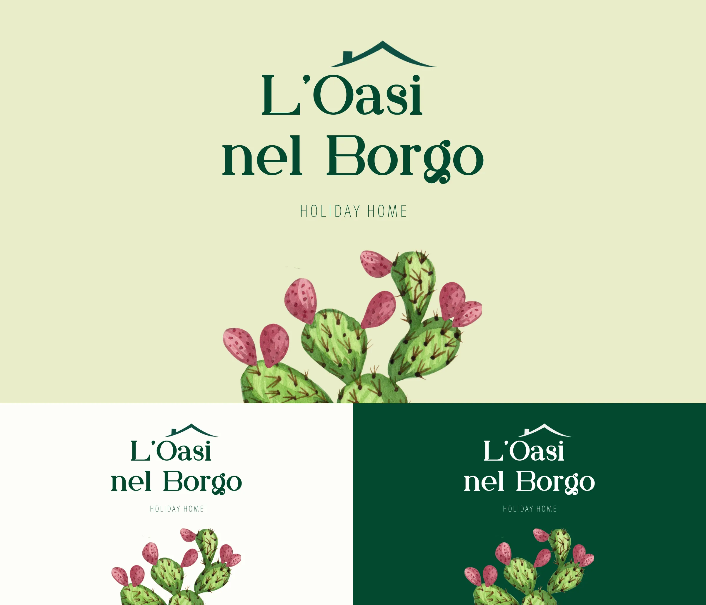
Quiet, not anonymous.
A deliberately soft, understated identity, but recognizable enough not to blend into the neutral language of so many hospitality brands. Illustration, color and typography work together without overpowering the place they describe.
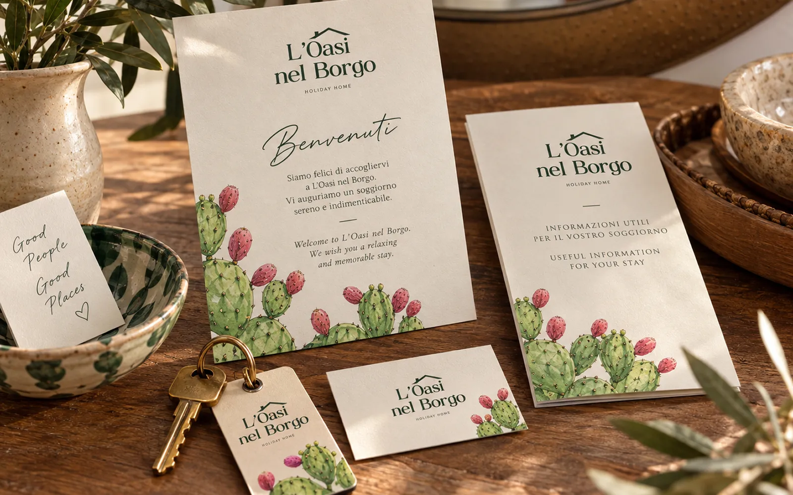
Made to welcome.
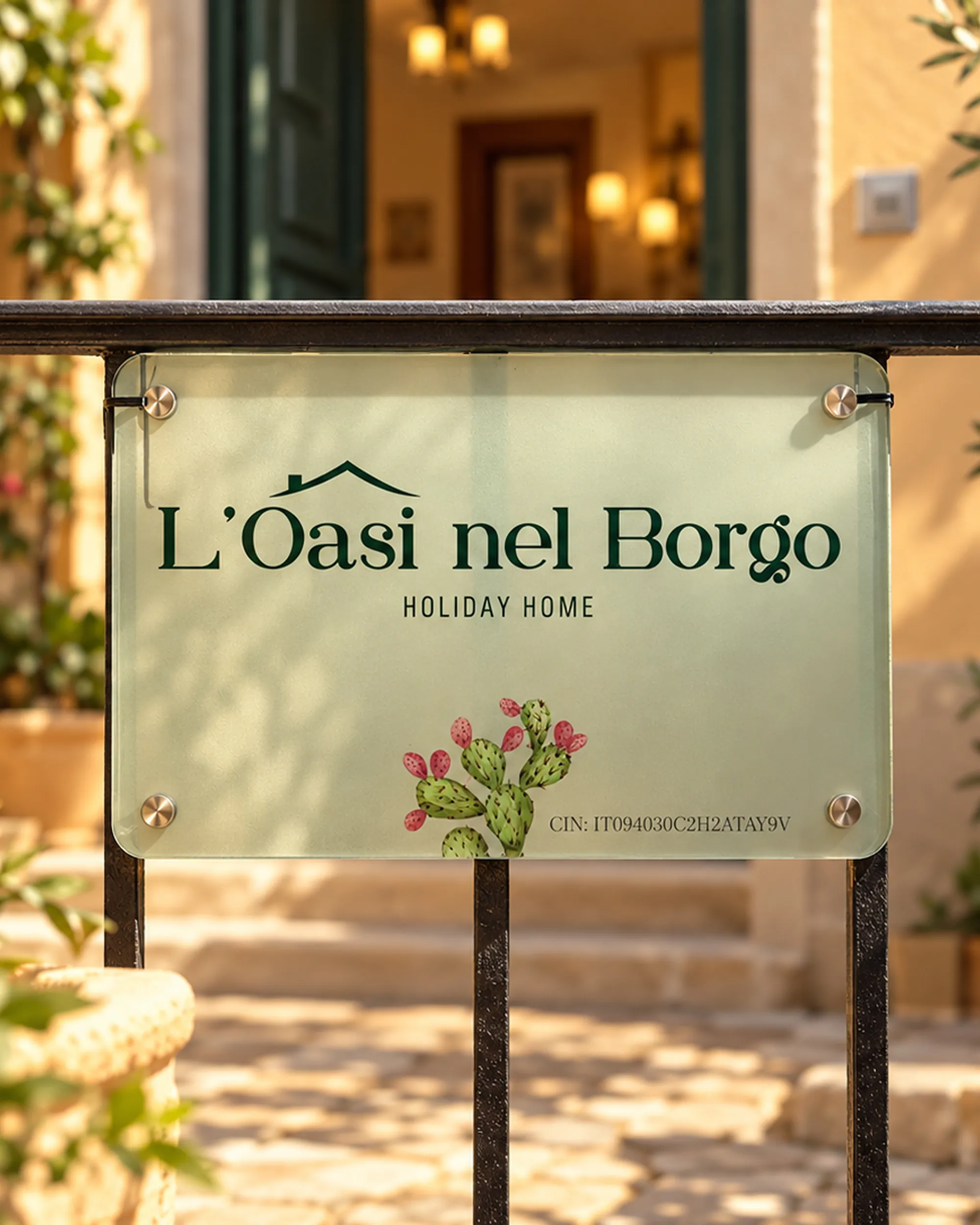
From the first contact online to arriving at the house, the identity accompanies the experience without taking center stage. From the welcome card to the glass plaque at the entrance, every piece keeps the same simple, welcoming tone.
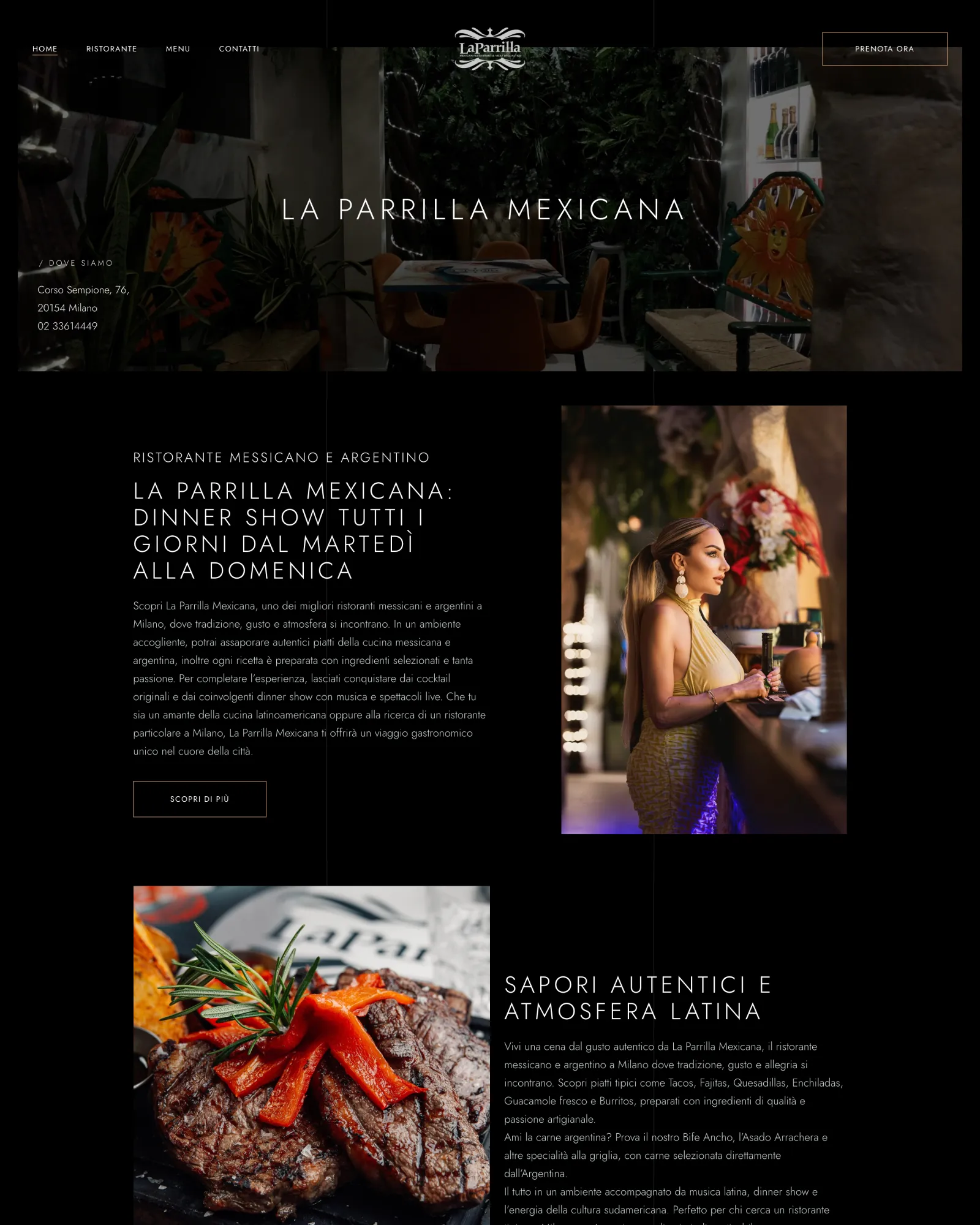
Dinner, drinks and a show.
La Parrilla Mexicana is a Mexican and Argentinian restaurant in Milan, also known for its dinner shows. The redesign brings the restaurant's atmosphere online and makes it much easier to get to what matters: booking a table.
La Parrilla doesn't just sell dinner. Food, atmosphere, music and the show are all part of the same experience.
It needed a website that could capture that character and shorten the path from discovering the restaurant to booking.
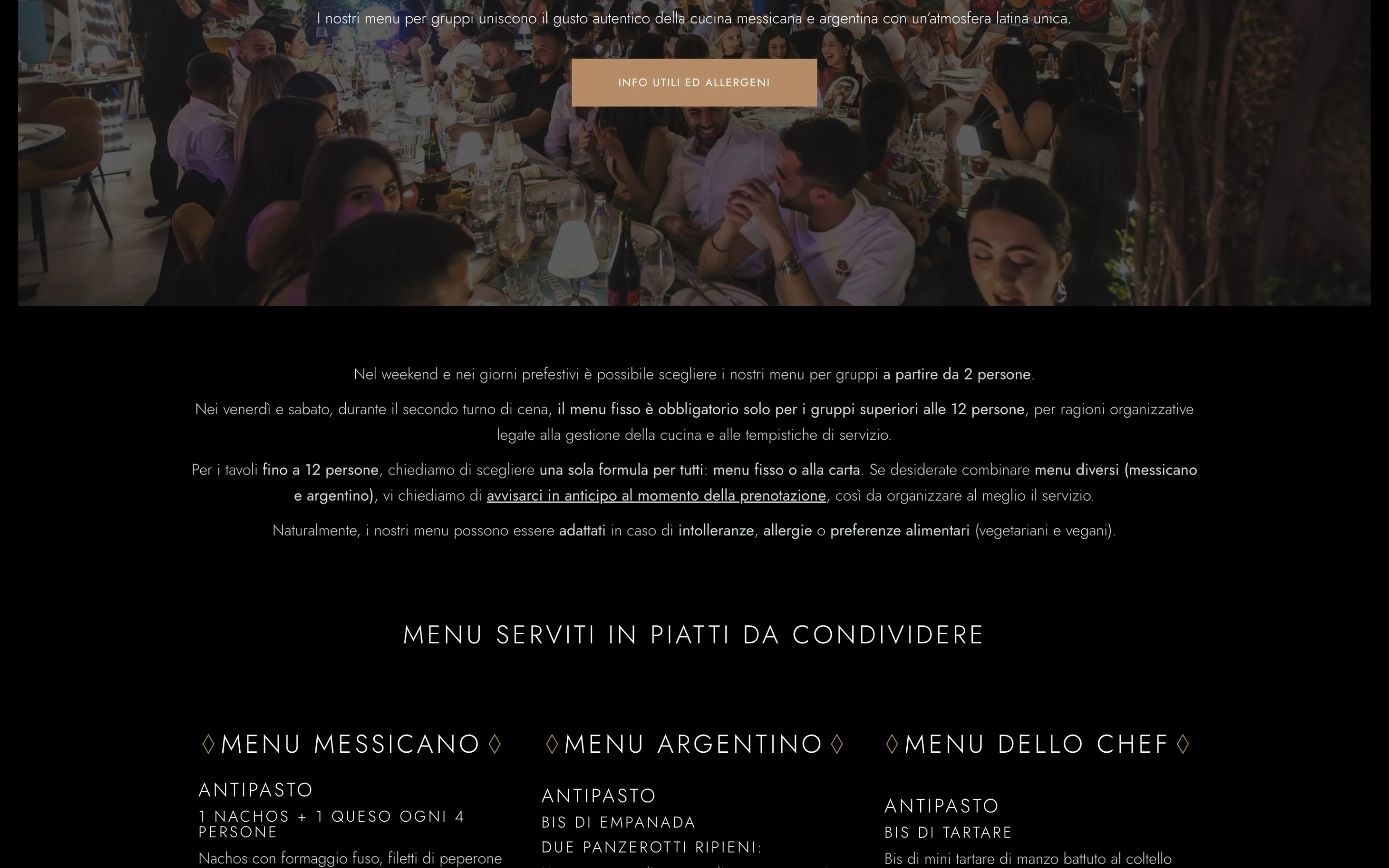
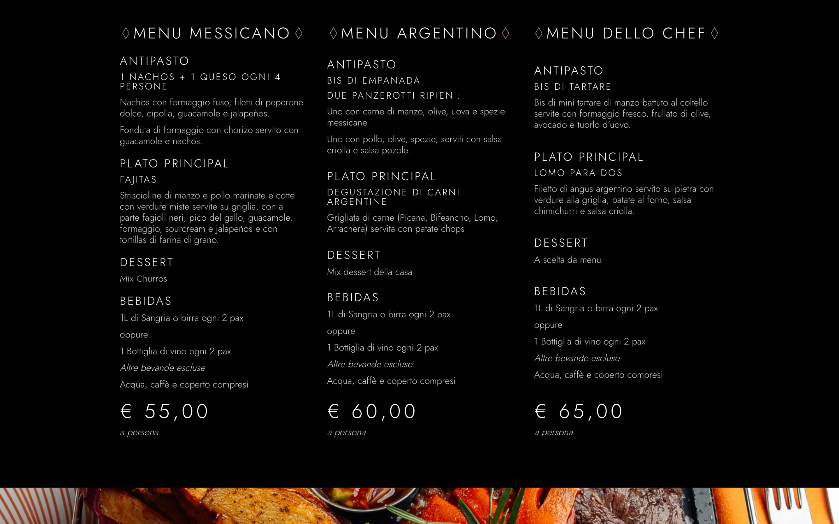
Make them hungry. Then make it easy to book.
Turning a physical, sensory experience into a website that sparks desire, without losing sight of conversion. Photos, menus, dinner shows and atmosphere had to lead naturally to a booking, without making anyone hunt for it.
From scroll to table.
Booking, always close.
Whatever gets you to the table.
The atmosphere comes first.
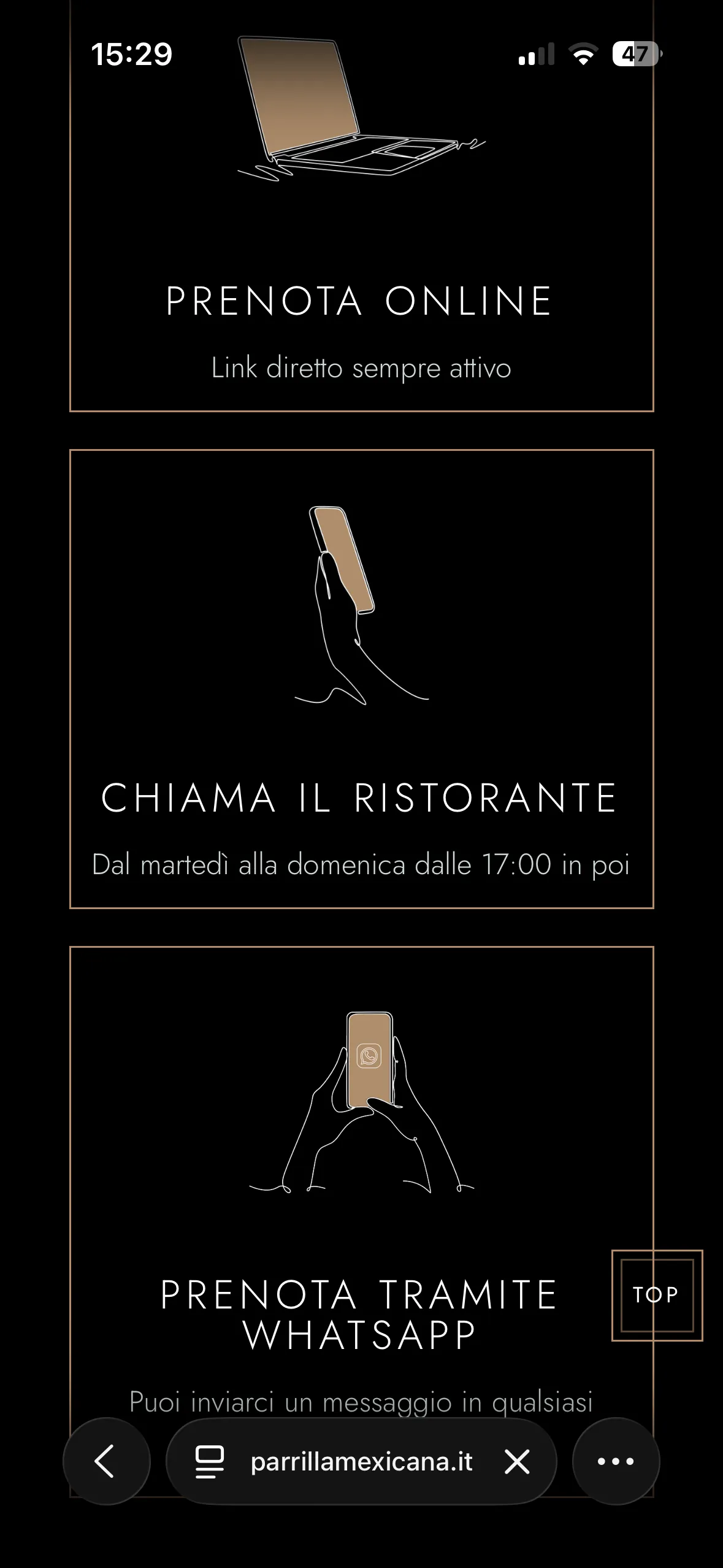
Less searching. More booking.
A website that better captures the La Parrilla experience and shortens the path from discovery to desire to booking.